Tag Archives: elegant

A label as rare as the wine itself.

Pinot Noir produced in the Santa Rita Hills of Santa Barbara County is some of the finest produced anywhere in the world. Uniquely their own style, the wines are rich, with hints of minerals, tobacco leaf, pepper, red cherry, and strawberry fruit.

MOI_Windrun_SRH_Vine1200

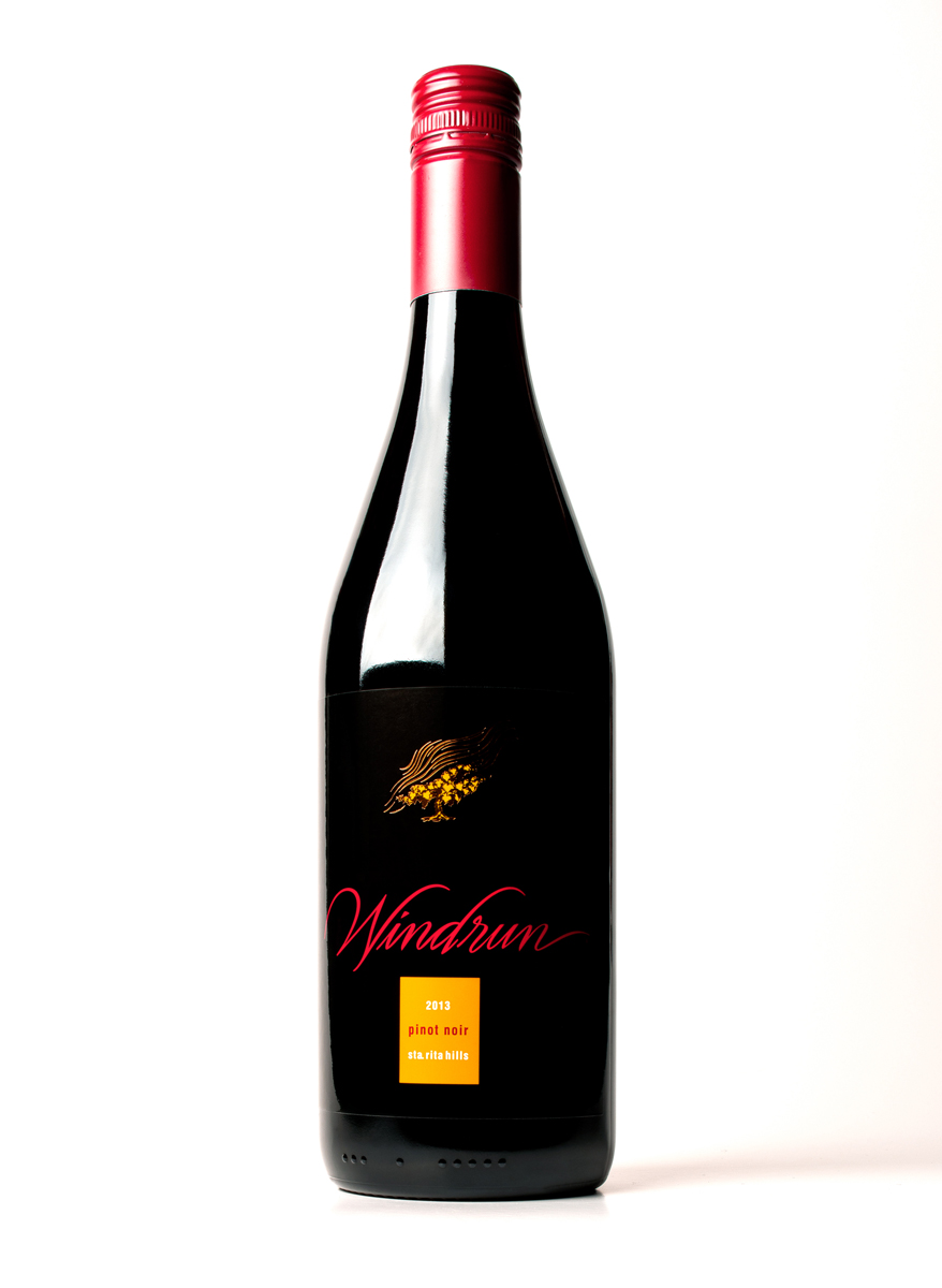
Windrun produced a limited production of 2013 SRH Pinot Noir to burnish the winery’s already good reputation with wine writers and knowledgeable consumers. They asked the group at MOI to come up with a label as classic as the wine itself.

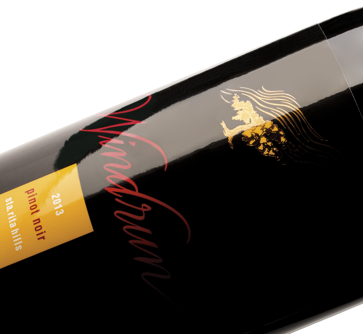
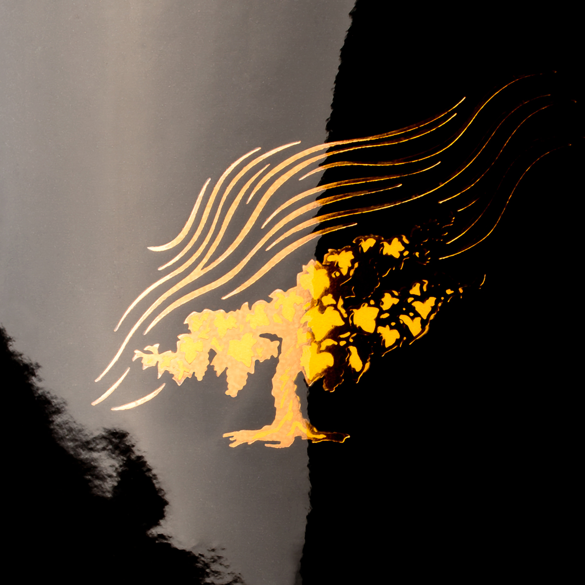
It is rare to see a wine label that is nearly all black. Using beautifully fluid letterforms, a vine drawn by renowned illustrator Tom Hennessey, and simple typography and color, we created a label of simple bespoke elegance. The most recent label printing technologies produced a mirror-like finish. Gold foil stamping, and rich, warm, colors help to give the label a stunning presence.

Windrun_SRH_label

The new design ties to the brand’s primary labels by sharing elements, but treats them in a new fashion, creating a minimal, elegant, and distinguished label, worthy of the wine within.

MOI_Windrun_SRH_full1200

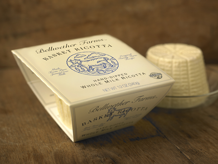
Bellwether Farms basket ricotta packaging

Bellwether Farms is an award-winning producer of farmstead cheeses and yogurts located in Sonoma County, California. A long-time client of our firm, they had invented a new way of crafting ricotta that brought to mind the exceptional qualities and flavors of the old-world ricottas of northern Italy.

A key component of capturing that quality was to use a special basket to allow the ricotta to drain and form properly. Removing the ricotta from the basket to package it would destroy the product’s unique qualities, so it was decided to keep the basket and vacuum form a plastic seal around it.

The large piece of stiff film necessary to form the basket’s lid presented unique challenges for packaging. The client and design team at MOI also saw an opportunity to use the basket to showcase the product. Keeping the sides open allowed the design team to create a flap that tucked in on either side, snapping into position and holding the basket firmly in place. The open sides doubled as a “window” displaying the product within the basket.

Mark Oliver, CEO of the branding firm, noted, “often the most work goes into creating simple looking yet complex structures. After a number of prototypes, this elegant solution met the criteria for showcasing the product and maintaining the long-established branding scheme, while using environmentally sensitive outer packaging materials and soy inks.”

Photo © 2011 Alan Campbell acpfoto.com