Tag Archives: Santa Barbara

Tapping millennials: Hair Care Package Design

MOI_ESN_1

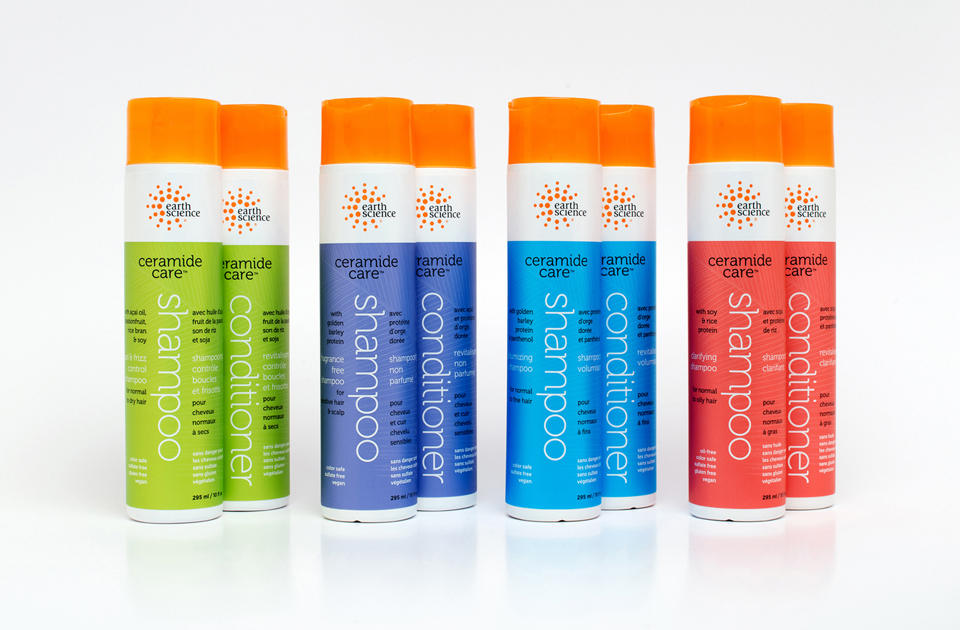
The assignment was clear: Promote Ceramide Care™, a ground-breaking new formulation for natural haircare products. Appeal to 18-33 year-old millennials shopping in Whole Foods and the natural channel. Accommodate French and English benefits copy. And create fun, vibrant, standout packaging that was different, progressive, fresh, and that would exceed industry expectations.

MOI_ESN_2

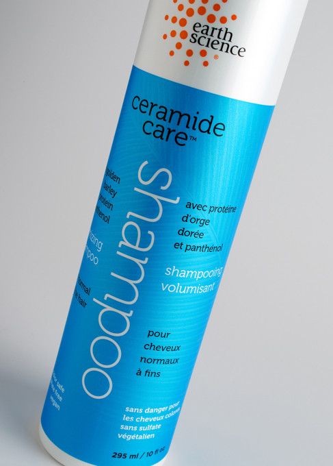
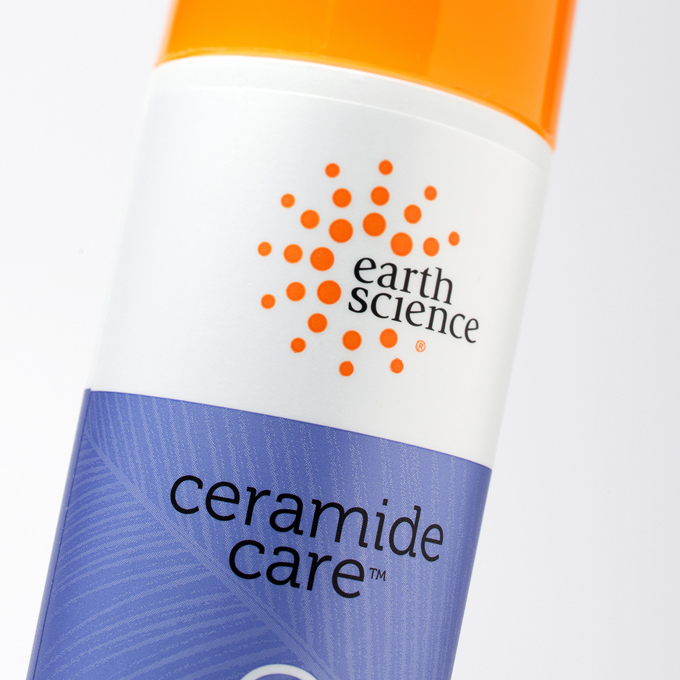
Millennials gravitate to authenticity and information. We did a deep dive into the product qualities and discovered what would become the graphics. The key attribute of these new products is their use of Ceramides. Simplifying the explanation of one approach used in its manufacture, the process of the synthesis of ceramide begins with the condensation of palmitate and serine. Palmitic acid mainly occurs as its ester in triglycerides, especially in palm oil. Serine is first obtained from silk protein.

MOI_ESN_3

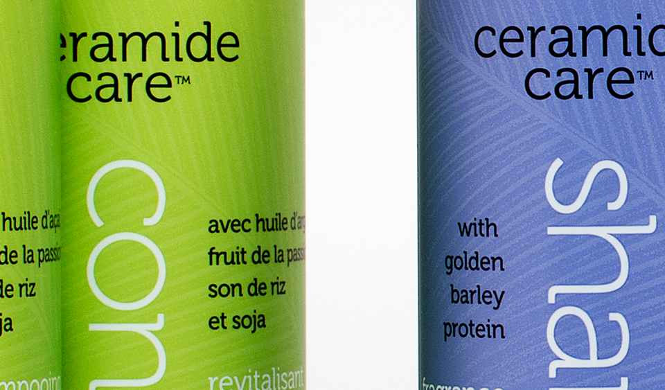
We used “palm” and “silk” as inspiration for the graphics and reproduction techniques applied to the containers. “Palm” was shown by using “ghosted” palm leaf images. “Silk” was made by using metallic inks printed on pearlescent film which created a shimmering look and a soft touch. Vertical type was used to clearly differentiate the word “shampoo” from the word “conditioner.” This is important when consumers are in a shower and cannot see clearly. And this design device allowed us to cleverly divide the French from the English copy.

MOI_ESN_4

After the project was completed, Dion Label Printing spotlighted the Earth Science package as an example of packaging excellence and to show their ability to recreate high end packaging art.

“Ceramide Care,” trademark, and packaging ©2016 Earth Science Naturals.

A label as rare as the wine itself.

Pinot Noir produced in the Santa Rita Hills of Santa Barbara County is some of the finest produced anywhere in the world. Uniquely their own style, the wines are rich, with hints of minerals, tobacco leaf, pepper, red cherry, and strawberry fruit.

MOI_Windrun_SRH_Vine1200

Windrun produced a limited production of 2013 SRH Pinot Noir to burnish the winery’s already good reputation with wine writers and knowledgeable consumers. They asked the group at MOI to come up with a label as classic as the wine itself.

It is rare to see a wine label that is nearly all black. Using beautifully fluid letterforms, a vine drawn by renowned illustrator Tom Hennessey, and simple typography and color, we created a label of simple bespoke elegance. The most recent label printing technologies produced a mirror-like finish. Gold foil stamping, and rich, warm, colors help to give the label a stunning presence.

Windrun_SRH_label

The new design ties to the brand’s primary labels by sharing elements, but treats them in a new fashion, creating a minimal, elegant, and distinguished label, worthy of the wine within.

MOI_Windrun_SRH_full1200

Personal care products packaging design: the wrappings of enchantment.

The promise of looking fresh and youthful is beguiling. The demand for products to achieve those looks is constantly growing. Personal care products that deliver results using healthier and more pure ingredients are a fast growing segment of the competitive category. Now, more than ever, people seek brands containing all-natural ingredients. While Earth Science was ahead of the pack in recognizing this important lifestyle trend, they faced competition that constantly updated positioning and graphic imagery. Earth Science made a proactive decision to maintain a leadership position by refreshing their own brand and packaging.

Earth Science Branding

The team at MOI (Mark Oliver, Inc.) audited the line and the competition and proposed these objectives: Redesign the trademark; create a system identity that the consumer could quickly recognize; and prioritize and simplify label information, making the redesigned trademark the #1 point of the packaging line. The design team set about creating multiple designs reflecting the objectives. Once finalized, MOI handed off the project to the firm’s in-house group to implement. “The new, unified packaging program has provided the product line with a far greater shelf presence,” noted Mark Oliver, principal of the firm. “In a busy category, organization of packaging is crucial. This design program nicely balances organization and creativity.”

Earth Science Packaging.