Tag Archives: packaging design

How to market Mochi ice cream to consumers.

BBHfamily_8417_0453_flt

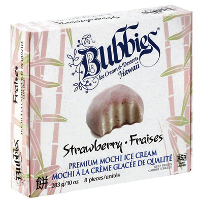
Bubbies Hawaii got its start over 30 years ago making slow-churned premium ice cream in the Hawaiian Islands. After becoming one of the most popular regional ice creams, it introduced mochi ice cream: a partially flattened sweet rice dough ball wrapped around an ice cream core. Sales took off. To expand their nationwide sales, Bubbies needed to re-design their branding and packaging.

The team at MOI (Mark Oliver, Inc.) found that no brand was doing a decent job of presenting mochi ice cream to the buying public and that a good opportunity existed to stand apart from the crowd. For example, photos or illustrations failed to give the product of any manufacturer appetite appeal. And none showed product or explained what they were in such a way that to a consumer unfamiliar with mochi ice cream would want to try them—unless they were already buying them. That approach does not grow sales.

Sakura 8517_0547 flt__crpd

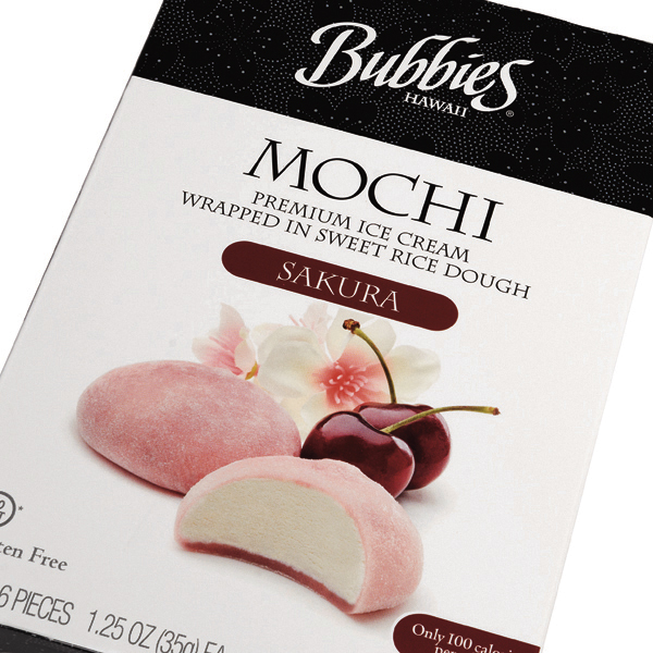
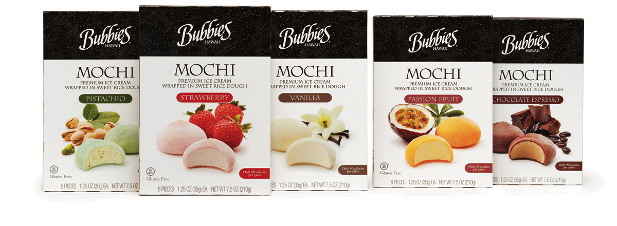
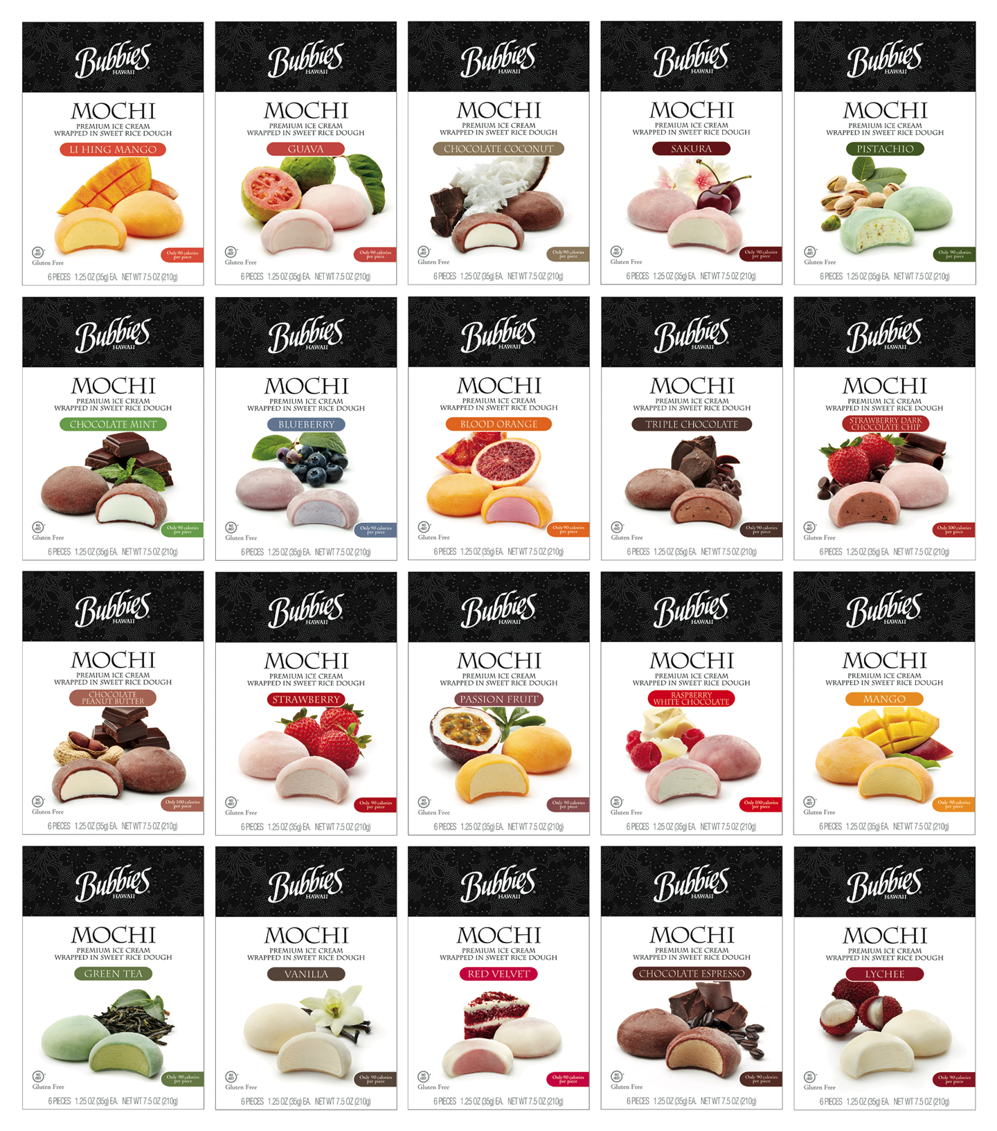
MOI focused on creating appealing visual images of the 20+ SKUs: various exotic fruits and ingredients made enticing flavor cues. We made a new wordmark that was easily read yet referenced the old. The team used classic type faces, an easy-to-understand explanation of what a mochi was, and added plenty of white space to focus attention on the hero shot, completing the identity lockup for Bubbies. The new design re-positioned Bubbies mochi ice cream as visually appealing and a decidedly upscale dessert and treat.

Bubbies_Line

Old packaging

BBH old pkg

Spirits branding, au naturel.

1. Forager_Trio_0142_F

Forager is a craft distillery located on California’s Central Coast. They hand-make single batch spirits using the “pure heart of the spirit”and select locally harvested fruits and grains and hand-gathered wild herbs as ingredients.

2. Forager_Gin_closeup_0112_F

The design team researched the marketplace, strategized product positioning, and proposed an abrupt departure from typical spirit label design to illuminate the brand’s unique qualities and capture attention.

3. Forager_Whiskey_0097_F

Beginning by creating the name—a reference to how ingredients are sourced, MOI commissioned colorful illustrations of plants used during distillation to tell the story of each spirit.

4. Forager_Vodka_closeup_0121_F_SQ

A “badge” on the clear front label of each designates the source of the ingredients and calls out the salient spirit details.

5. Forager_Rum_0143_F_sq

Well bread packaging.

Galasso’s Bakery
Strategy, Branding, Packaging Design, Production Superivison (PDF)

GalassosGrp_Flat_8rgb

Well bread packaging.

Founded in 1968, Galasso’s Bakery began as a family-run business. Over the years, the company had grown from a single delicatessen into a full-line bakery of 110,000 square feet with 6 production lines providing baked goods to more than 3,000 wholesale customers throughout the west. But nothing was under their own name.

Sensing that it was time to capitalize on their years of experience, they decided to start their own line of breads. MOI (Mark Oliver, Inc.) was tapped to refresh the trademark and create new packaging. After completing a marketplace audit, strategizing product positioning, and with the client leaning towards a modernist aesthetic, the design team proposed a bold, clean, and decidedly uncluttered format that would stand out in the crowded baked goods set.

Colors overlaid with matte varnishes, combined with the package’s evocative sans serif fonts, geometric grid, and large window showcase the breads, creating a strong branding platform and identity lockup for the line of 8 SKUs. Application of the new identity was also applied to delivery vehicles, corporate identity materials, trade show materials, and collateral.

Galasso'sLogo_2rgb