Galasso’s Bakery
Strategy, Branding, Packaging Design, Production Superivison (PDF)
Well bread packaging.
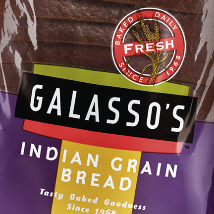
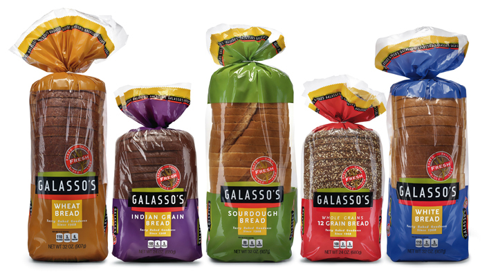
Founded in 1968, Galasso’s Bakery began as a family-run business. Over the years, the company had grown from a single delicatessen into a full-line bakery of 110,000 square feet with 6 production lines providing baked goods to more than 3,000 wholesale customers throughout the west. But nothing was under their own name.
Sensing that it was time to capitalize on their years of experience, they decided to start their own line of breads. MOI (Mark Oliver, Inc.) was tapped to refresh the trademark and create new packaging. After completing a marketplace audit, strategizing product positioning, and with the client leaning towards a modernist aesthetic, the design team proposed a bold, clean, and decidedly uncluttered format that would stand out in the crowded baked goods set.
Colors overlaid with matte varnishes, combined with the package’s evocative sans serif fonts, geometric grid, and large window showcase the breads, creating a strong branding platform and identity lockup for the line of 8 SKUs. Application of the new identity was also applied to delivery vehicles, corporate identity materials, trade show materials, and collateral.