Tag Archives: fresh

American grilling meets Danish smoke.

Logo

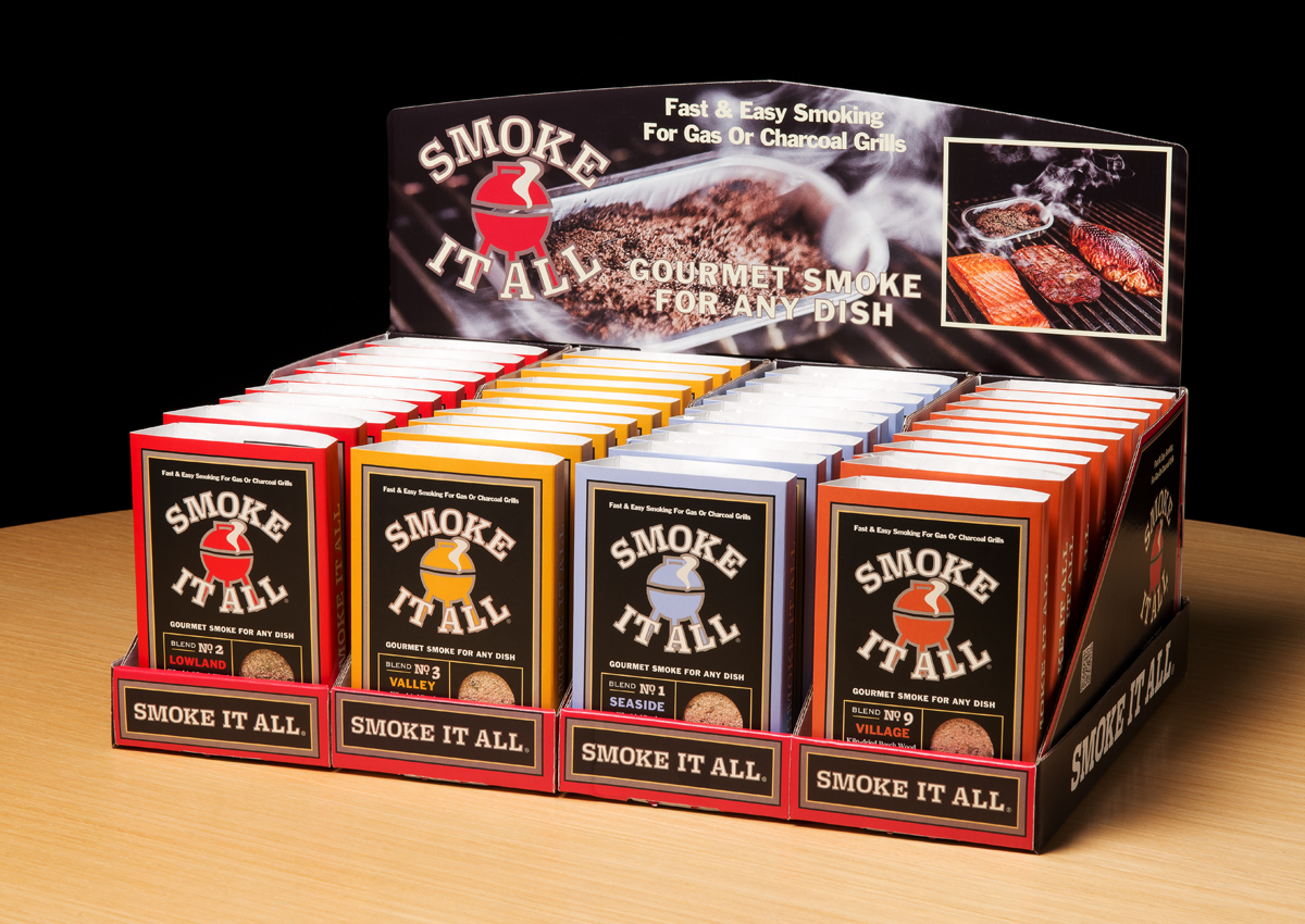
The backyard BBQ is a fixture in almost every U.S. home. Everyone has their own way of grilling meats and veggies. Some chefs prefer gas; yet others enjoy the flavor of Mesquite. But an increasing number opt for the savory flavors of the smoker.

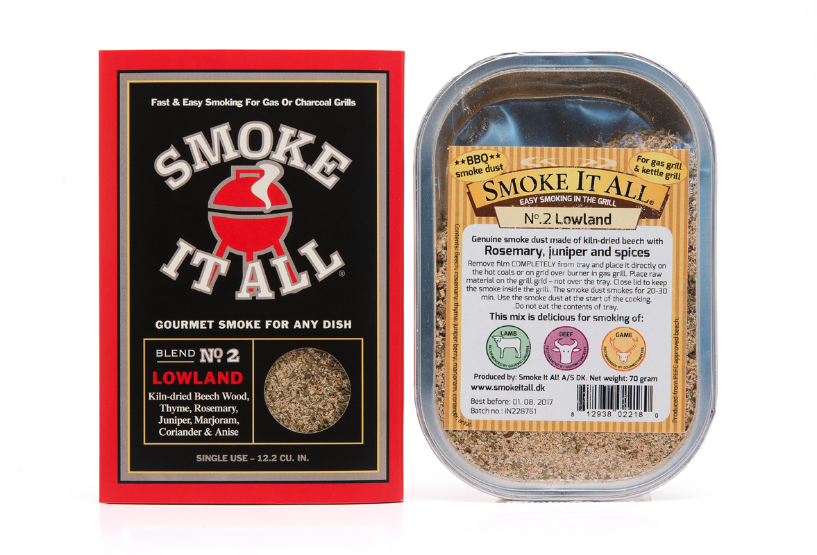
What if you could combine the best of both—grill and smoke at the same time? Made in Denmark, our client’s trays contain a mix of beech-wood dust and spices. When heated, the tray emits flavored smoke. But packaging that sold in Denmark did not sell here. The product line had to be re-made for the States.

DSC_5342

New and old packaging.

 The challenge to the team at MOI was to create packaging that was appropriate to the target consumer: males 25-55, who dominate the grilling demographic. The product line had to show flavor components, and work in modular display configurations.

DSC_5334

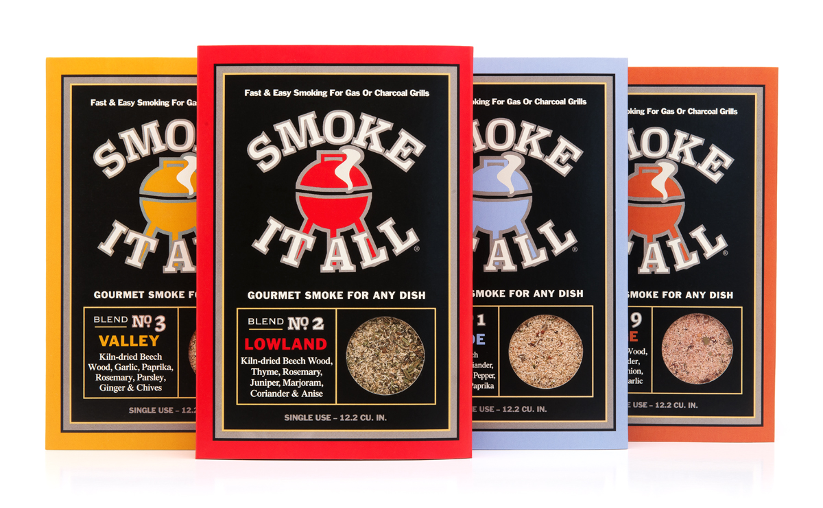
In strategizing the makeover, we proposed using a sleeve instead of a label. This provided the product with a “billboard.” A logo was designed to indicate product use. Iconic graphics conveyed product qualities, and windows showed the mixes. Modular POS structures enabled the line to fit into the deli section of grocery stores as well as hardware store grilling departments.

DSC_5338

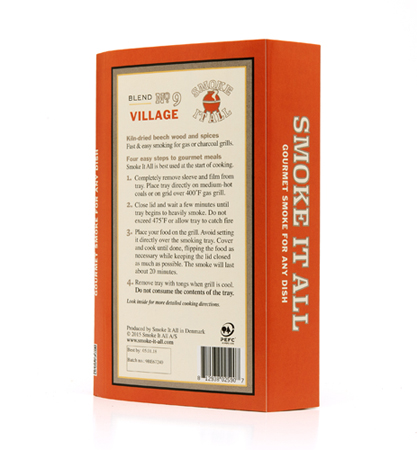
Positioned with the statements: “Fast & easy smoking for gas or charcoal grills” and “Gourmet smoke for any dish,” the products arrived stateside in time for the peak-grilling season.

DSC_5370

Old world sweets discover the new world.

ZLC_thumbnail

In 1860, Mohammad Zalatimo opened a pastry shop in Jerusalem, not far from the Church of the Holy Sepulchre. The shop made favorite middle-eastern sweets like Mamul, Baklava, Barazik and Greibeh.

_DSC3974A

Four generations later, the Zalatimo family sought out MOI (Mark Oliver, Inc.) to prepare the brand for entry to the U.S. market. The unique selling proposition was simple: Old World sweets come to America. The finest locally-sourced natural ingredients, no artificial ingredients or preservatives, and every single one of the sweets handmade. The target was natural and specialty food consumers.

_DSC3979A

The objective of the positioning, branding and packaging was to show the artisanal qualities of the product while projecting an image of high quality using a modern design palette that would appeal to the consumer. In other words, we wanted a look not too old, not too new.

_DSC3963A

A rich burgundy matches the color of the traditional packaging used in the middle east, while modern fonts and playful cadmium yellow stripes bring attention to the package. The handmade products are featured prominently on each package and promote the appetite appeal of the sweets.

ZLC_before

Previous packaging.

A label as rare as the wine itself.

Pinot Noir produced in the Santa Rita Hills of Santa Barbara County is some of the finest produced anywhere in the world. Uniquely their own style, the wines are rich, with hints of minerals, tobacco leaf, pepper, red cherry, and strawberry fruit.

MOI_Windrun_SRH_Vine1200

Windrun produced a limited production of 2013 SRH Pinot Noir to burnish the winery’s already good reputation with wine writers and knowledgeable consumers. They asked the group at MOI to come up with a label as classic as the wine itself.

It is rare to see a wine label that is nearly all black. Using beautifully fluid letterforms, a vine drawn by renowned illustrator Tom Hennessey, and simple typography and color, we created a label of simple bespoke elegance. The most recent label printing technologies produced a mirror-like finish. Gold foil stamping, and rich, warm, colors help to give the label a stunning presence.

Windrun_SRH_label

The new design ties to the brand’s primary labels by sharing elements, but treats them in a new fashion, creating a minimal, elegant, and distinguished label, worthy of the wine within.

MOI_Windrun_SRH_full1200