Tag Archives: sleeve

American grilling meets Danish smoke.

Logo

The backyard BBQ is a fixture in almost every U.S. home. Everyone has their own way of grilling meats and veggies. Some chefs prefer gas; yet others enjoy the flavor of Mesquite. But an increasing number opt for the savory flavors of the smoker.

What if you could combine the best of both—grill and smoke at the same time? Made in Denmark, our client’s trays contain a mix of beech-wood dust and spices. When heated, the tray emits flavored smoke. But packaging that sold in Denmark did not sell here. The product line had to be re-made for the States.

DSC_5342

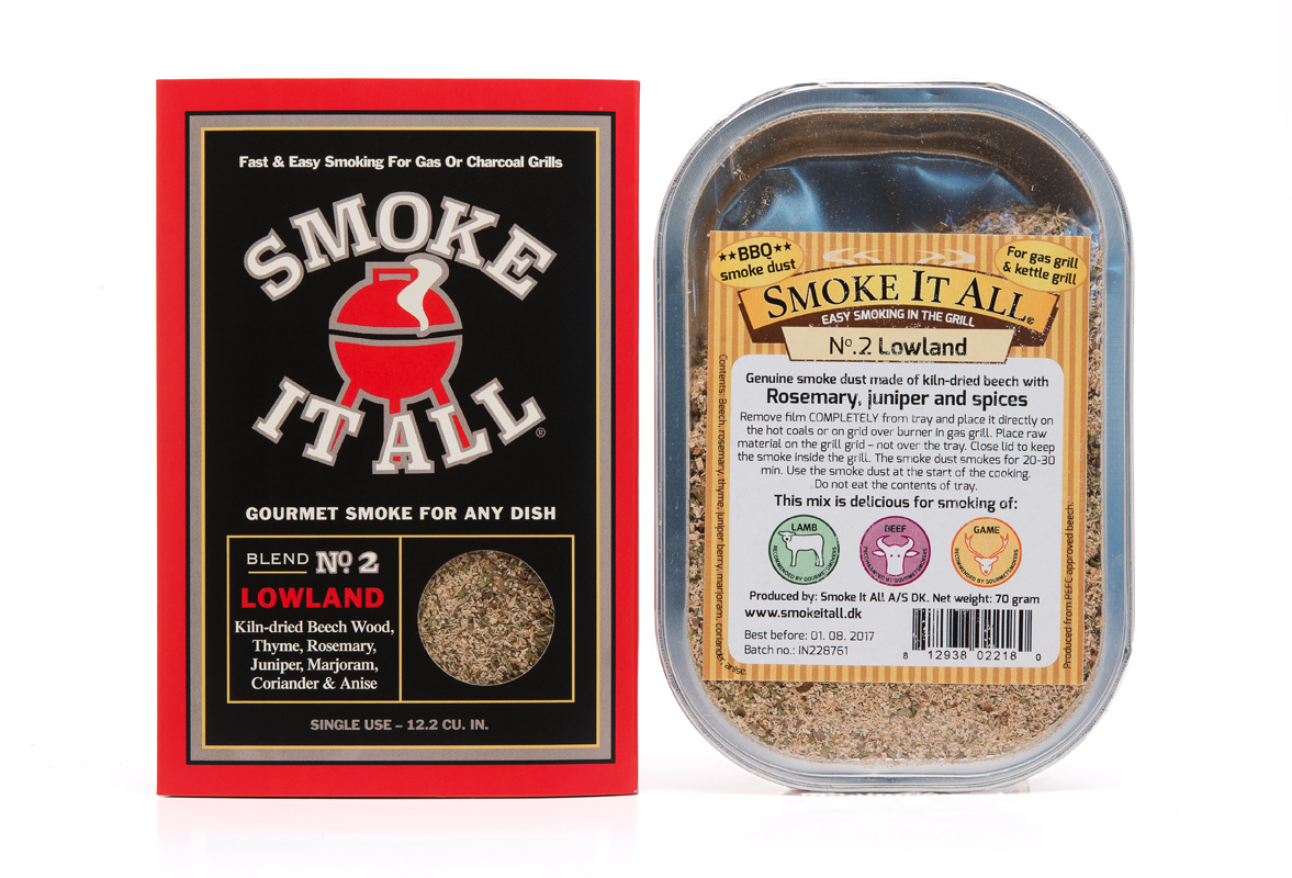
New and old packaging.

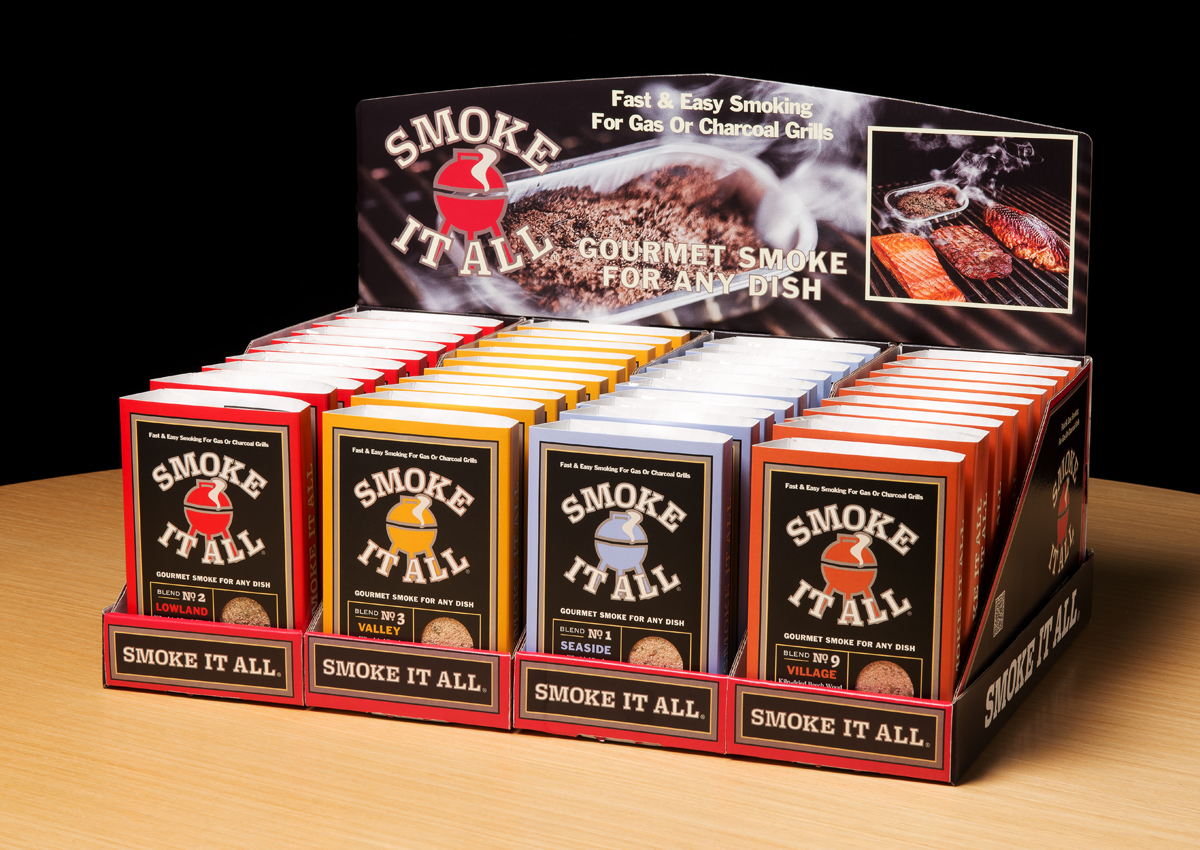
 The challenge to the team at MOI was to create packaging that was appropriate to the target consumer: males 25-55, who dominate the grilling demographic. The product line had to show flavor components, and work in modular display configurations.

DSC_5334

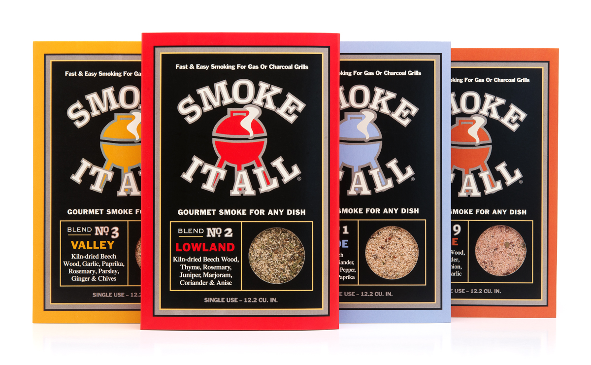
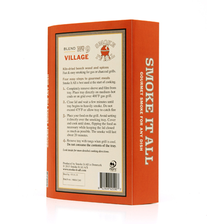
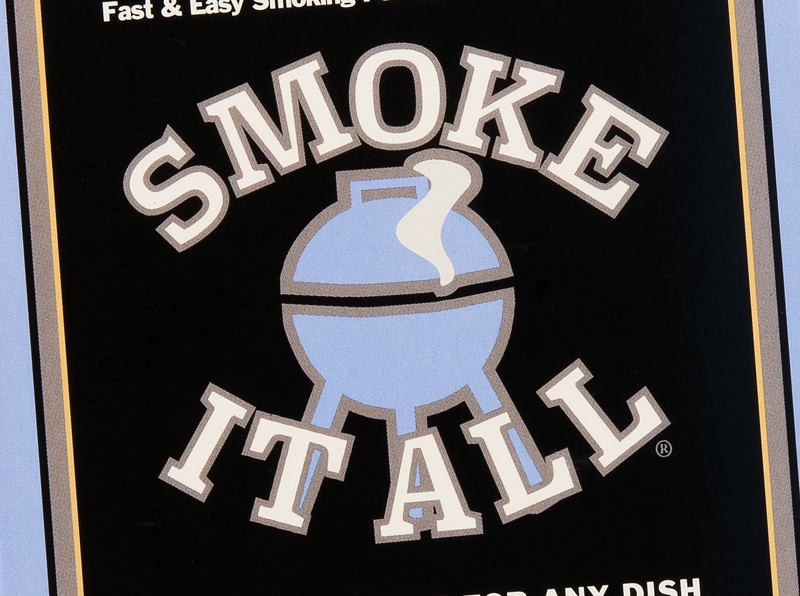
In strategizing the makeover, we proposed using a sleeve instead of a label. This provided the product with a “billboard.” A logo was designed to indicate product use. Iconic graphics conveyed product qualities, and windows showed the mixes. Modular POS structures enabled the line to fit into the deli section of grocery stores as well as hardware store grilling departments.

DSC_5338

Positioned with the statements: “Fast & easy smoking for gas or charcoal grills” and “Gourmet smoke for any dish,” the products arrived stateside in time for the peak-grilling season.

DSC_5370

Timeless packaging design for today’s consumer

Research has shown that an emerging trend in CPG is the consumer’s desire to purchase products that offer comfort and convenience, along with healthy ingredients. Comfort translates into design and images that evoke authenticity, trust, and even nostalgia.The challenge of convenience is to convey that a product is easy to use. Healthy ingredients translates into products that are fresh and natural.

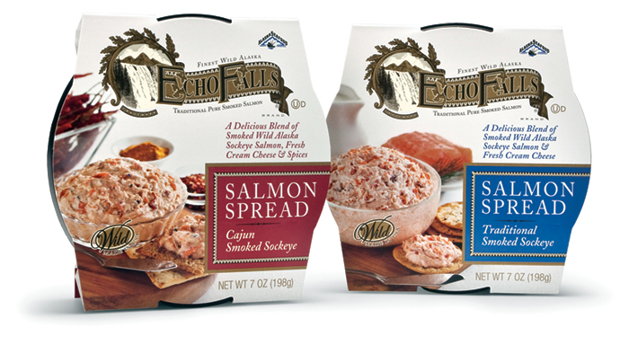
The country’s leading producer of smoked seafood and long-time MOI client Ocean Beauty Seafood approached the creative team with the challenge to create new packaging for a line of fresh-made salmon spreads to be sold in delicatessen departments in supermarkets.

Using the research as a starting point, the team crafted a branded appearance that invoked the nostalgia for the authenticity of an earlier period, in this case the Victorian-era, using a “heritage” look. The packaging incorporates copy and visual cues throughout to convey the ready-to-use aspect of the product. A big marketing plus is the product’s use of wild caught sockeye salmon, which is a sustainable fish, a fact which was included in many places on the package. Additionally, for shelf display, the innovative sleeve has the ability to stand up on its edge.

Agency principal Mark Oliver noted that the key considerations “were to assure the buyer that the products had the authentic taste and quality of an old-world smoked salmon product while at the same time providing all the values and conveniences that modern consumers look for. We think the packaging delivers on all counts.”