Tag Archives: agency

Giving a pioneer organic coffee brand a new buzz

1. Cafe Altura Farmer

The Origins of Cafe Altura date back to the late 1970’s when a group of organic enthusiasts gathered in Ojai, California to live and work on a 75-acre citrus farm. Their idea was to farm the ranch organically and develop related businesses.

2. Cafe Altura 10oz bags

One afternoon, a group of visitors told them a story of a farm in Mexico that had been growing coffee using organic and Biodynamic techniques for 20 years. They went off to Chiapas, Mexico, and begin importing organically-grown coffee beans, becoming the first company in the U.S. to do so.

3. Cafe Altura 12oz cans

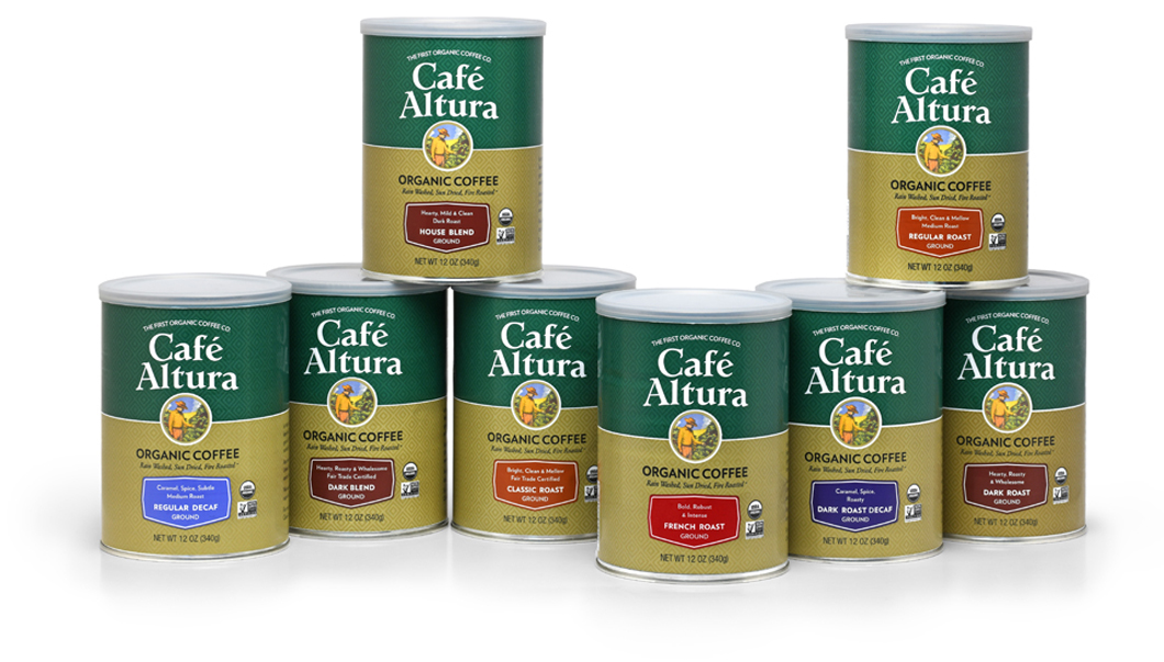
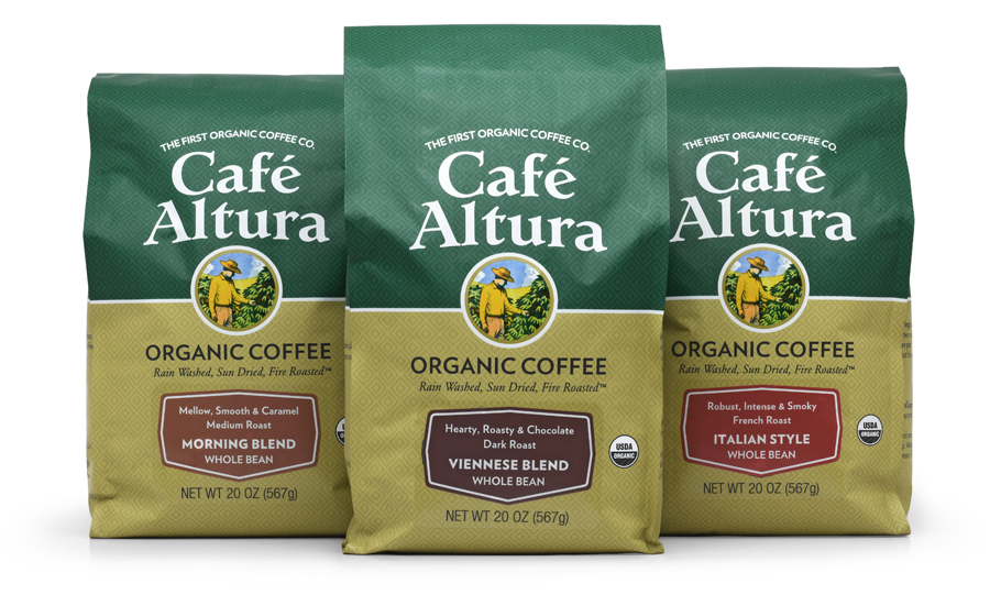
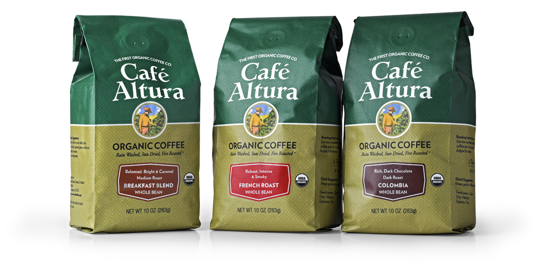
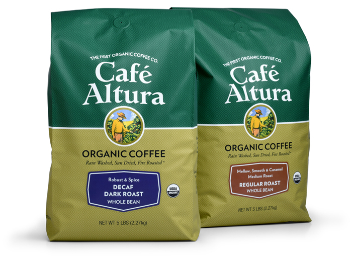
Cafe Altura has been in business for more than thirty years but the branding had not been updated since the 1980s. We were given the assignment to create new branding and packaging designs, stress organic, improve quality and value perceptions and increase visibility in the store. The design had to work with whole bean, ground and instant products for more than 80 SKUs.

4. Cafe Altura 5lb bags

We focused on the firm’s authenticity, the real “story” behind the product; on organic ingredients; on the quality of the beans sourced from family farms; and on a great taste experience.

5. Cafe Altura Instant web

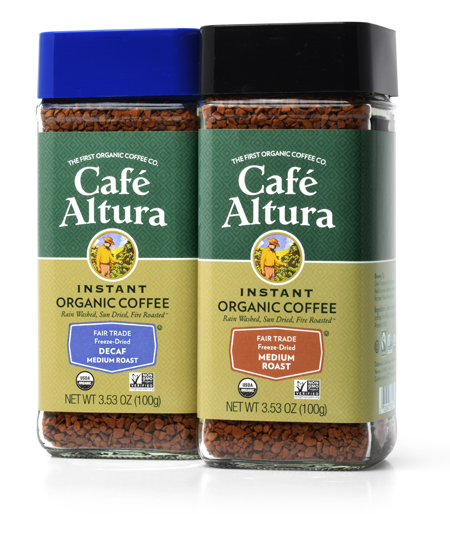
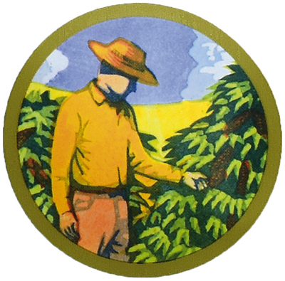
We created a narrative of the company history with the text and specific visual cues. An illustration of a farmer tending his coffee trees anchors the concept visually, focusing attention on the organically grown family-farm product link. The new look projects a warm, friendly, feeling to the consumer and has been well-received by customers, brokers, distributors and store buyers.

6. Cafe Altura 1.25lb

American grilling meets Danish smoke.

Logo

The backyard BBQ is a fixture in almost every U.S. home. Everyone has their own way of grilling meats and veggies. Some chefs prefer gas; yet others enjoy the flavor of Mesquite. But an increasing number opt for the savory flavors of the smoker.

What if you could combine the best of both—grill and smoke at the same time? Made in Denmark, our client’s trays contain a mix of beech-wood dust and spices. When heated, the tray emits flavored smoke. But packaging that sold in Denmark did not sell here. The product line had to be re-made for the States.

DSC_5342

New and old packaging.

 The challenge to the team at MOI was to create packaging that was appropriate to the target consumer: males 25-55, who dominate the grilling demographic. The product line had to show flavor components, and work in modular display configurations.

DSC_5334

In strategizing the makeover, we proposed using a sleeve instead of a label. This provided the product with a “billboard.” A logo was designed to indicate product use. Iconic graphics conveyed product qualities, and windows showed the mixes. Modular POS structures enabled the line to fit into the deli section of grocery stores as well as hardware store grilling departments.

DSC_5338

Positioned with the statements: “Fast & easy smoking for gas or charcoal grills” and “Gourmet smoke for any dish,” the products arrived stateside in time for the peak-grilling season.

DSC_5370

Old world sweets discover the new world.

ZLC_thumbnail

In 1860, Mohammad Zalatimo opened a pastry shop in Jerusalem, not far from the Church of the Holy Sepulchre. The shop made favorite middle-eastern sweets like Mamul, Baklava, Barazik and Greibeh.

_DSC3974A

Four generations later, the Zalatimo family sought out MOI (Mark Oliver, Inc.) to prepare the brand for entry to the U.S. market. The unique selling proposition was simple: Old World sweets come to America. The finest locally-sourced natural ingredients, no artificial ingredients or preservatives, and every single one of the sweets handmade. The target was natural and specialty food consumers.

_DSC3979A

The objective of the positioning, branding and packaging was to show the artisanal qualities of the product while projecting an image of high quality using a modern design palette that would appeal to the consumer. In other words, we wanted a look not too old, not too new.

_DSC3963A

A rich burgundy matches the color of the traditional packaging used in the middle east, while modern fonts and playful cadmium yellow stripes bring attention to the package. The handmade products are featured prominently on each package and promote the appetite appeal of the sweets.

ZLC_before

Previous packaging.