Tag Archives: marketing

Graphis honors MOI for brand work.

We are pleased to announce that our branding work for Bellwether Farms has been awarded a Gold Award in Graphis Branding 6.

Graphis Branding 6 presents the work of some of the biggest names in design today. Hundreds of images from the year’s award-winning branding campaigns are displayed in a lavishly produced publication and on their website. Graphis publishes the world’s most significant and influential works from the greatest talent in Design, Advertising, and Photography.

Mark Oliver, Inc - Graphis BrandingB

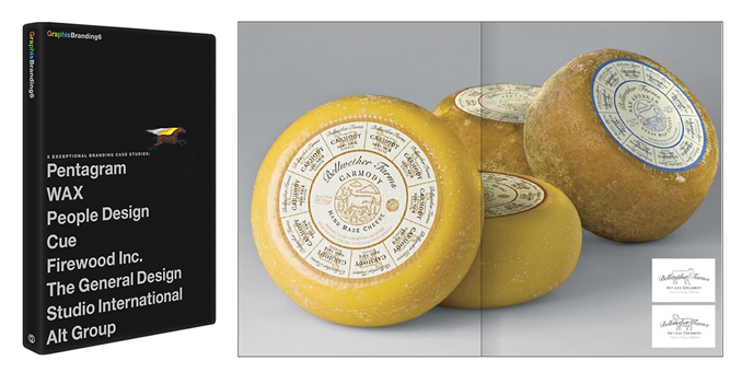
49 design agencies from 18 countries (22 from the USA) were selected for Platinum and Gold awards. Only three firms from California were recipients. To see all of the award-winning work for Bellwether Farms, visit: http://www.graphis.com/entry/d02e2090-4b30-11e2-a2c9-f23c91dffdec/

Selections of the work of Mark Oliver, Inc. are in the permanent collection of the Library of Congress. It has received more than 450 international and national awards. Mr. Oliver is a recipient of the AIGA/Santa Barbara Fellow recognition. He is a member of the Board of Trustees of Brooks Institute http://www.brooks.edu/.

Bellwether Farms basket ricotta packaging

Bellwether Farms is an award-winning producer of farmstead cheeses and yogurts located in Sonoma County, California. A long-time client of our firm, they had invented a new way of crafting ricotta that brought to mind the exceptional qualities and flavors of the old-world ricottas of northern Italy.

A key component of capturing that quality was to use a special basket to allow the ricotta to drain and form properly. Removing the ricotta from the basket to package it would destroy the product’s unique qualities, so it was decided to keep the basket and vacuum form a plastic seal around it.

The large piece of stiff film necessary to form the basket’s lid presented unique challenges for packaging. The client and design team at MOI also saw an opportunity to use the basket to showcase the product. Keeping the sides open allowed the design team to create a flap that tucked in on either side, snapping into position and holding the basket firmly in place. The open sides doubled as a “window” displaying the product within the basket.

Mark Oliver, CEO of the branding firm, noted, “often the most work goes into creating simple looking yet complex structures. After a number of prototypes, this elegant solution met the criteria for showcasing the product and maintaining the long-established branding scheme, while using environmentally sensitive outer packaging materials and soy inks.”

Photo © 2011 Alan Campbell acpfoto.com

Tarazi Falafel Mix: Making something old new again.

Tarazai is found in specialty and ethnic food stores nationwide. For the past 40 years, consumers have used the traditional middle eastern mix of ground chickpeas and fava beans to recreate the familiar dishes they grew up with or left behind in their native countries.

But not long ago a funny thing happened. Falafel began showing up in restaurants and food trucks in places like New York City. A generation of new users is emerging eager to consume at home the foods they’ve grown to enjoy when eating out, or during travels abroad.

The management at Tarazi noticed the increase in interest in Falafel and asked MOI to help them expand the brand appeal to new markets. The challenge for the team at MOI was to refresh the brand to appeal to the new consumer while not alienating the old one.

An additional challenge the team discovered was the need to separate the product from “protein substitute” products. Research showed that traditional consumers and younger ones alike were attracted to the product because of its great taste and traditional nature, not because it made a good veggie burger or meat substitute.

Falafel and vegetables tumbling into the open pita signify the fresh taste experience consumers expect while portraying the well-known use of Falafel. Reference to meat substitutes was dropped, and copy was added on the benefits of the product.

The trademark was redrawn with proper letterforms, but retained the feel of the old logo for past consumers. The crisp and clean presentation sets the product apart from others in the ethnic foods section.

As agency CEO Mark Oliver noted, “this refreshing design creates the impact and interest to pull a consumer to a great old product, now new again.”