“The teller of stories has everywhere and always found eager listeners” Stith Thompson, “The Folktale”
 Flexo printed yogurt cups.
Bellwether Farms is California’s original sheep dairy. The family-owned creamery, located in the hills of western Sonoma County, is an award-winning pioneer in the production of sheep and cow milk aged farmstead cheeses and yogurts. The objective for the team at MOI (Mark Oliver, Inc.) was to create a memorable branding program that projected the character of the Callahan family farm and the artisan quality of the products.
 A sleeve over the cup creates a prominent billboard. A warm ivory color adds to the natural look of the line.
Our solution was to create a brand story which conveyed the hand-crafted qualities of the products. The use of charming illustrations and a muted color palette had the advantage of not only reflecting the values of the country farm, it also kept the reproduction to an affordable three-colors. The art was easily reproduced on a variety of structures and stocks using flexography or lithography. It graphically stands out on a web page.
 The lid of the cup is printed so the product can be identified once opened.

But mainly, we created a stylish and approachable brand which stood out from a crowd of look-alike products. We went the opposite direction from the competition. We zigged when everyone else zagged.
Since the rollout of the brand and packaging, Bellwether Farms has grown to be one of the most successful producers of artisan cheeses and yogurts in the country. As an added bonus, the branding and design have been recognized with dozens of awards from every major magazine, website, and competition, receiving most recently a Gold Award for branding from Graphis.
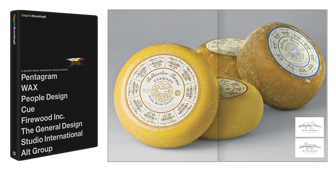
 These artisan cheese wheels are shipped whole to specialty shops and retailers. After considerable searching, we found a food-grade paper stock that was opaque enough to print on, that would also adhere to the surface of the cheese, and could easily be cut without tearing. The cheeses are sliced along the radiating lines, providing the consumer with a brand label on the piece they take home.
Credits: Illustrations by Sudi McCollum; photography by Alan Campbell and Eric Gordon. Photography © of the photographers.