Tag Archives: personal care products

Roll-on perfume packaging debuts stunningly appropriate graphics.

“In a crowded marketplace, fitting in is a failure…
Not standing out is the same as being invisible.”
– Seth Godin

Sarabecca is an artisan craft perfumery making natural fragrances from all-natural plant-based essential oils and fragrance essences, without synthetics, animal ingredients, or testing.

DSC_8612_crpd2

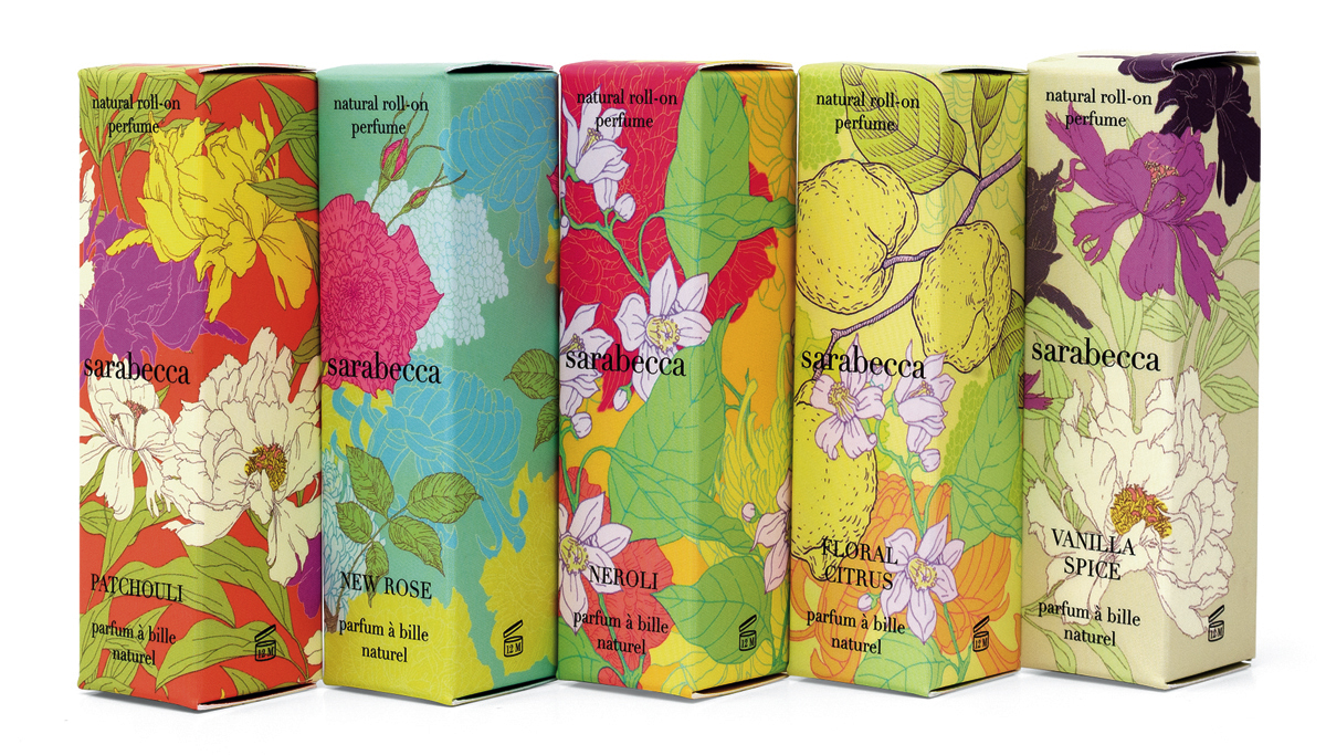
Our re-design assignment was to come up with a fresh, new look for their natural spray floral fragrances which were competing in a very crowded product category. In addition, the package had to primarily appeal to millennial buyers shopping at Whole Foods and other natural products stores.

Starting from scratch, the team at MOI identified key strategic visual cues that would both attract and alert the target consumer to the varied product scents. Using close-ups of vivid floral illustrations of the flowers associated with each fragrance, the unified line presents a unique and appealing face to consumers. New York-based illustrator Yana Beylinson was tapped to create vivid floral illustrations of the flowers associated with each fragrance.

MOI_Sarabecca_2-angled

The product line debuted to very favorable reviews at the Natural Products Expo trade show and has shown strong and steady sales gains since the redesign. To learn more about this project and others, please visit www.markoliverinc.com

Tapping millennials: Hair Care Package Design

MOI_ESN_1

The assignment was clear: Promote Ceramide Care™, a ground-breaking new formulation for natural haircare products. Appeal to 18-33 year-old millennials shopping in Whole Foods and the natural channel. Accommodate French and English benefits copy. And create fun, vibrant, standout packaging that was different, progressive, fresh, and that would exceed industry expectations.

MOI_ESN_2

Millennials gravitate to authenticity and information. We did a deep dive into the product qualities and discovered what would become the graphics. The key attribute of these new products is their use of Ceramides. Simplifying the explanation of one approach used in its manufacture, the process of the synthesis of ceramide begins with the condensation of palmitate and serine. Palmitic acid mainly occurs as its ester in triglycerides, especially in palm oil. Serine is first obtained from silk protein.

MOI_ESN_3

We used “palm” and “silk” as inspiration for the graphics and reproduction techniques applied to the containers. “Palm” was shown by using “ghosted” palm leaf images. “Silk” was made by using metallic inks printed on pearlescent film which created a shimmering look and a soft touch. Vertical type was used to clearly differentiate the word “shampoo” from the word “conditioner.” This is important when consumers are in a shower and cannot see clearly. And this design device allowed us to cleverly divide the French from the English copy.

MOI_ESN_4

After the project was completed, Dion Label Printing spotlighted the Earth Science package as an example of packaging excellence and to show their ability to recreate high end packaging art.

“Ceramide Care,” trademark, and packaging ©2016 Earth Science Naturals.

Personal care products packaging design: the wrappings of enchantment.

The promise of looking fresh and youthful is beguiling. The demand for products to achieve those looks is constantly growing. Personal care products that deliver results using healthier and more pure ingredients are a fast growing segment of the competitive category. Now, more than ever, people seek brands containing all-natural ingredients. While Earth Science was ahead of the pack in recognizing this important lifestyle trend, they faced competition that constantly updated positioning and graphic imagery. Earth Science made a proactive decision to maintain a leadership position by refreshing their own brand and packaging.

Earth Science Branding

The team at MOI (Mark Oliver, Inc.) audited the line and the competition and proposed these objectives: Redesign the trademark; create a system identity that the consumer could quickly recognize; and prioritize and simplify label information, making the redesigned trademark the #1 point of the packaging line. The design team set about creating multiple designs reflecting the objectives. Once finalized, MOI handed off the project to the firm’s in-house group to implement. “The new, unified packaging program has provided the product line with a far greater shelf presence,” noted Mark Oliver, principal of the firm. “In a busy category, organization of packaging is crucial. This design program nicely balances organization and creativity.”

Earth Science Packaging.