Take a look at the proposed changes.
In a fast-changing marketplace, where package design and brands are ever-changing, the staid Nutrition Label has remained the same for 20 years. A ground-breaking addition to the food industry in 1993, nutrition and ingredient labeling opened the doors for consumers to better understand the nutritional values of foods, and to help them make healthier choices for themselves and their families.
So what is the FDA proposing to change, why, and when?
* The big noticeable change is to the design of the label. New is the more simplified, easier-to-read appearance (see before and after below). The second noticeable design change is there is no way you are going to miss how many calories you are consuming. That information reads loud and clear (and maybe a bit too much).
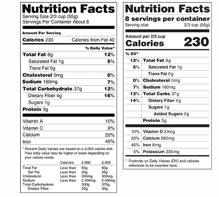
Existing nutrition label left side and proposed label right side
* Serving sizes are being adjusted to what is typically consumed today. Back in 1993 when nutrition labels first appeared, a typical serving size was smaller. Today the public seems to be eating more and not counting calories as accurately.
* Added sugars will now be listed along with sugar. The average American consumes 300 calories of added sugars per day. By including this on the label, consumers will know how much sugar has been added to the product.
* Calories from fat will no longer be listed. Research shows that the type of fat is more important than the amount.
* Daily values have shifted to the left-hand side of the label to draw eyes there first.
* Vitamin D and potassium declarations are now required. Data shows that some of the U.S. population is not getting enough of these nutrients.
Why is this happening now?
One-third of American adults are obese. This epidemic has caused rates of diabetes to soar and increased the risk of stroke, cancer, and heart disease. Making labels easier to understand is critical to communicating quickly and effectively with consumers. The FDA forecasts that changes to nutritional labeling could result in $20-30 billion in public health benefits.
What is the timeline?
The FDA is dividing the proposed Nutrition Facts label changes into two proposed rules. The first updates the nutrition facts listings based on newer nutritional science and revises the label design to help highlight that information. The second proposed change is to serving sizes and labeling for certain package sizes.
Both rules are published for comment for 90 days in the Federal Register. To read and comment, visit the FDA’s official docket at www.regulations.gov. The FDA proposes the food industry be given two years to comply after publication of any final rules. They put the cost of industry implementation at $2 billion.
As award-winning veterans of the package design world, MOI was making nutrition labels for clients when they were originally mandated and we are here for you today. We are well-versed in FDA regulation compliance. Let us help you update your packaging to meet the new regulations.