Tag Archives: packaging

How to build a Greek food brand.

HF_Logo

Where do brands come from? Many have a rich legacy, others are created from scratch. Armed with the ambition to sell their Greek food products in the U.S. and a desire to win over the American consumer with superior flavors and quality, we were approached by a manufacturer to position, name, brand, and design packaging for their pistachio products. According to the USDA, consumption of pistachio nuts is increasing due to their health benefits. Most grocery stores carry one or more brands of pistachios and the financial impact of the U.S. pistachio industry exceeds $1.5 billion.

HF_Pist1

But these pistachios were different; they were Greek. In the past decade the popularity and sales of Greek food products has exploded due to the attention focused on the healthful Mediterranean diet. There are no imported Greek Pistachios in the U.S. marketplace. Because the source of the product was Greece, it was a very clean product, and the intended market would be places like Whole Foods, it was obvious to position the product as a healthy imported Greek product.

HF_OpenBag

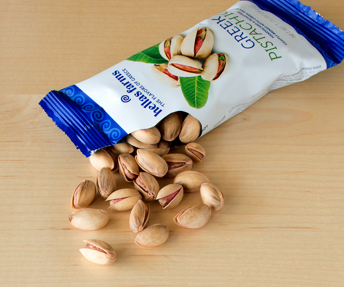
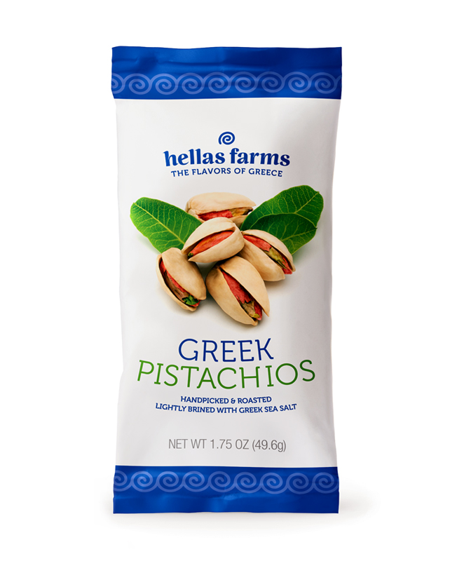
Naming was the next step. Our solution, “Hellas Farms,” communicated the brand’s origins using the original name English-speaking people used for Greece. Next, we solidified the message with the tagline “The Flavors of  Greece,” additionally identifying the origin while opening the door to other types of line extensions.

HF_Tray

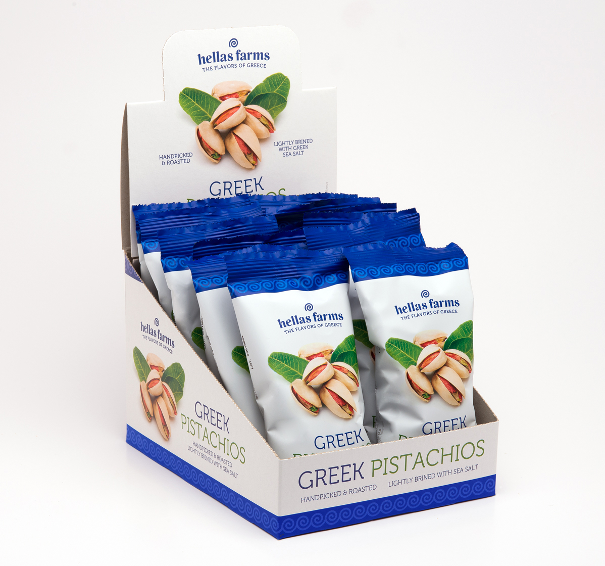
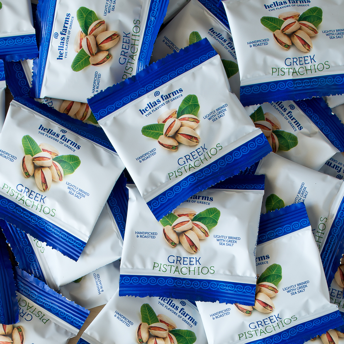
Using selected Greek iconography, images, colors, and fonts to evoke the “Greek” origination of the product, we created a design for mass-marketing Greek Pistachios which would appeal to consumers in the 25+ category, and stand out in the salty snack sector of grocery or at the checkout-stand. Made market-ready in 1.75 oz bags featuring a cluster of pistachios and the feature copy “handpicked & roasted, lightly brined with Greek sea salt,” Hellas Farms Greek Pistachios made their way across the Atlantic to the American consumer this past summer and is rolling out first on the east coast.

HF_Samples
SAMPLE BAGS

American grilling meets Danish smoke.

Logo

The backyard BBQ is a fixture in almost every U.S. home. Everyone has their own way of grilling meats and veggies. Some chefs prefer gas; yet others enjoy the flavor of Mesquite. But an increasing number opt for the savory flavors of the smoker.

What if you could combine the best of both—grill and smoke at the same time? Made in Denmark, our client’s trays contain a mix of beech-wood dust and spices. When heated, the tray emits flavored smoke. But packaging that sold in Denmark did not sell here. The product line had to be re-made for the States.

DSC_5342

New and old packaging.

 The challenge to the team at MOI was to create packaging that was appropriate to the target consumer: males 25-55, who dominate the grilling demographic. The product line had to show flavor components, and work in modular display configurations.

DSC_5334

In strategizing the makeover, we proposed using a sleeve instead of a label. This provided the product with a “billboard.” A logo was designed to indicate product use. Iconic graphics conveyed product qualities, and windows showed the mixes. Modular POS structures enabled the line to fit into the deli section of grocery stores as well as hardware store grilling departments.

DSC_5338

Positioned with the statements: “Fast & easy smoking for gas or charcoal grills” and “Gourmet smoke for any dish,” the products arrived stateside in time for the peak-grilling season.

DSC_5370

Old world sweets discover the new world.

ZLC_thumbnail

In 1860, Mohammad Zalatimo opened a pastry shop in Jerusalem, not far from the Church of the Holy Sepulchre. The shop made favorite middle-eastern sweets like Mamul, Baklava, Barazik and Greibeh.

_DSC3974A

Four generations later, the Zalatimo family sought out MOI (Mark Oliver, Inc.) to prepare the brand for entry to the U.S. market. The unique selling proposition was simple: Old World sweets come to America. The finest locally-sourced natural ingredients, no artificial ingredients or preservatives, and every single one of the sweets handmade. The target was natural and specialty food consumers.

_DSC3979A

The objective of the positioning, branding and packaging was to show the artisanal qualities of the product while projecting an image of high quality using a modern design palette that would appeal to the consumer. In other words, we wanted a look not too old, not too new.

_DSC3963A

A rich burgundy matches the color of the traditional packaging used in the middle east, while modern fonts and playful cadmium yellow stripes bring attention to the package. The handmade products are featured prominently on each package and promote the appetite appeal of the sweets.

ZLC_before

Previous packaging.