Tag Archives: graphic packaging design

Personal care products packaging design: the wrappings of enchantment.

The promise of looking fresh and youthful is beguiling. The demand for products to achieve those looks is constantly growing. Personal care products that deliver results using healthier and more pure ingredients are a fast growing segment of the competitive category. Now, more than ever, people seek brands containing all-natural ingredients. While Earth Science was ahead of the pack in recognizing this important lifestyle trend, they faced competition that constantly updated positioning and graphic imagery. Earth Science made a proactive decision to maintain a leadership position by refreshing their own brand and packaging.
Earth Science Branding

The team at MOI (Mark Oliver, Inc.) audited the line and the competition and proposed these objectives: Redesign the trademark; create a system identity that the consumer could quickly recognize; and prioritize and simplify label information, making the redesigned trademark the #1 point of the packaging line. The design team set about creating multiple designs reflecting the objectives. Once finalized, MOI handed off the project to the firm’s in-house group to implement. “The new, unified packaging program has provided the product line with a far greater shelf presence,” noted Mark Oliver, principal of the firm. “In a busy category, organization of packaging is crucial. This design program nicely balances organization and creativity.”
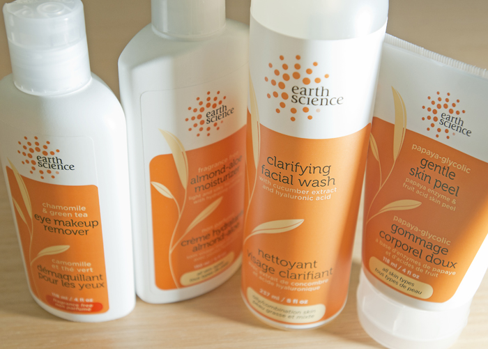
Earth Science Packaging.

Bellwether Farms basket ricotta packaging

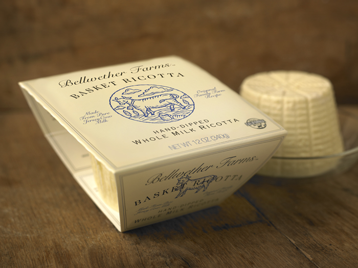
Bellwether Farms is an award-winning producer of farmstead cheeses and yogurts located in Sonoma County, California. A long-time client of our firm, they had invented a new way of crafting ricotta that brought to mind the exceptional qualities and flavors of the old-world ricottas of northern Italy.

A key component of capturing that quality was to use a special basket to allow the ricotta to drain and form properly. Removing the ricotta from the basket to package it would destroy the product’s unique qualities, so it was decided to keep the basket and vacuum form a plastic seal around it.

The large piece of stiff film necessary to form the basket’s lid presented unique challenges for packaging. The client and design team at MOI also saw an opportunity to use the basket to showcase the product. Keeping the sides open allowed the design team to create a flap that tucked in on either side, snapping into position and holding the basket firmly in place. The open sides doubled as a “window” displaying the product within the basket.

Mark Oliver, CEO of the branding firm, noted, “often the most work goes into creating simple looking yet complex structures. After a number of prototypes, this elegant solution met the criteria for showcasing the product and maintaining the long-established branding scheme, while using environmentally sensitive outer packaging materials and soy inks.”

Photo © 2011 Alan Campbell acpfoto.com