Tag Archives: Graphic Design

Allegretto Vineyard Resort

1. Allegretto Logo

Assignment. The Allegretto Vineyard Resort is a modern Tuscan Renaissance palazzo built around a stone-laid courtyard and surrounded by olive trees and vineyards in the hills of Paso Robles. Our assignment was to translate the vision of Ayres Hotel Group to communicate the graceful beauty and exclusive old-world charm and luxury of the high-end resort to their guests and the public.

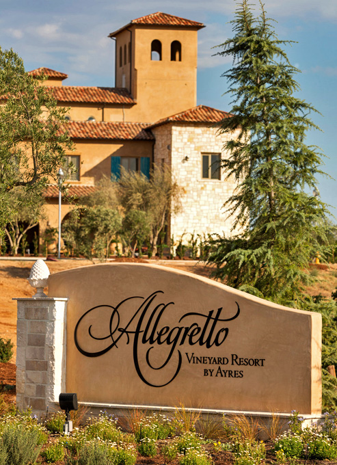
3. Allegretto Hero Sign

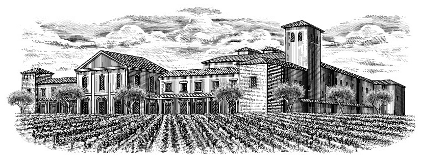
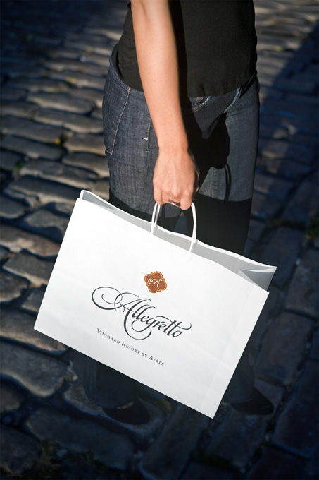
Approach. We focused on creating a comprehensive ‘period’ branding program that would position the resort as uniquely European with California overtones. In keeping with the historical theme, we used bespoke lettering and hand-drawn images of the resort.

2. Allegretto Illust

The primary type fonts used were Centaur and Arrighi, which are based on fonts originally created in Venice during the Renaissance. The color scheme is subdued, with rich tones. Simple is better.

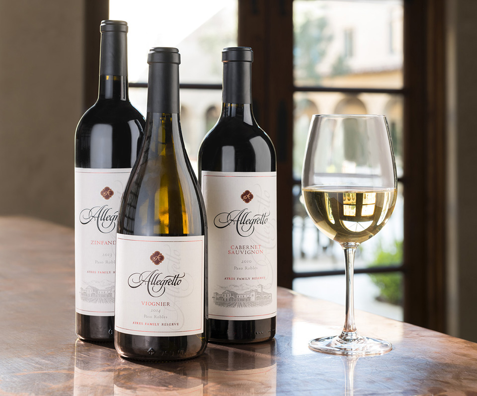
4. Allegretto Wine group

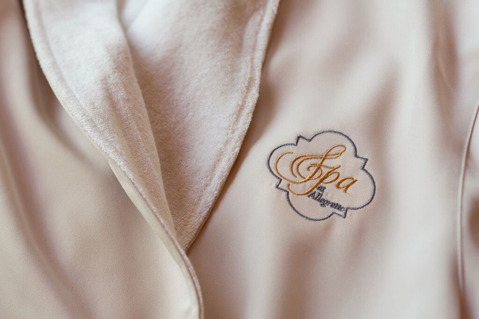
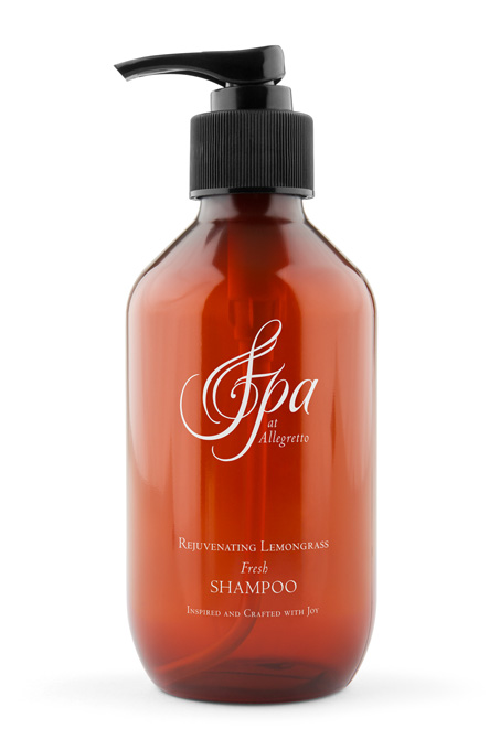
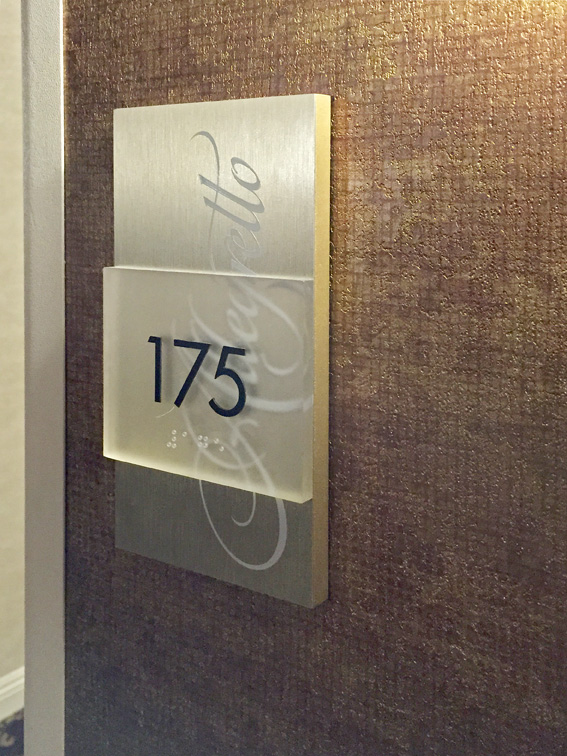
The branding program covered everything from the primary logotype identity to way-finding signage, bath robes, and spa items.

5. Allegretto Robe

7. Allegretto.Shampoo2

Results. The branding program seamlessly fit the personality of the resort and fulfilled the vision of the founders. The Allegretto has a 89% ‘excellent’ or ‘very good’ rating on Trip Advisor.

8. Allegretto directional signage_2sml

6. Allegretto Bag B

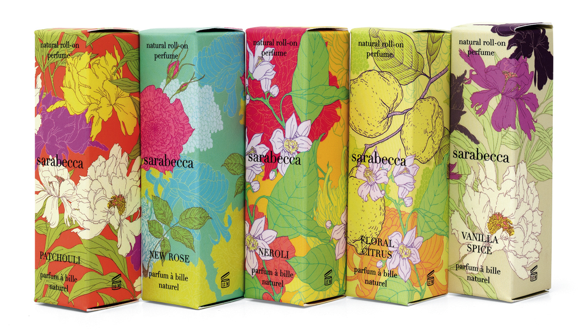
Roll-on perfume packaging debuts stunningly appropriate graphics.

“In a crowded marketplace, fitting in is a failure…
Not standing out is the same as being invisible.”
– Seth Godin

Sarabecca is an artisan craft perfumery making natural fragrances from all-natural plant-based essential oils and fragrance essences, without synthetics, animal ingredients, or testing.

DSC_8612_crpd2

Our re-design assignment was to come up with a fresh, new look for their natural spray floral fragrances which were competing in a very crowded product category. In addition, the package had to primarily appeal to millennial buyers shopping at Whole Foods and other natural products stores.

Starting from scratch, the team at MOI identified key strategic visual cues that would both attract and alert the target consumer to the varied product scents. Using close-ups of vivid floral illustrations of the flowers associated with each fragrance, the unified line presents a unique and appealing face to consumers. New York-based illustrator Yana Beylinson was tapped to create vivid floral illustrations of the flowers associated with each fragrance.

MOI_Sarabecca_2-angled

The product line debuted to very favorable reviews at the Natural Products Expo trade show and has shown strong and steady sales gains since the redesign. To learn more about this project and others, please visit www.markoliverinc.com

Tapping millennials: Hair Care Package Design

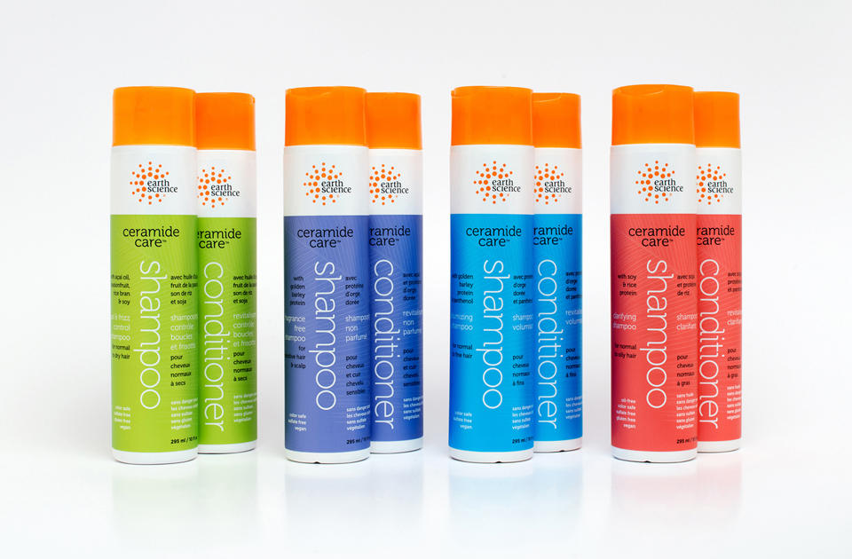
MOI_ESN_1

The assignment was clear: Promote Ceramide Care™, a ground-breaking new formulation for natural haircare products. Appeal to 18-33 year-old millennials shopping in Whole Foods and the natural channel. Accommodate French and English benefits copy. And create fun, vibrant, standout packaging that was different, progressive, fresh, and that would exceed industry expectations.

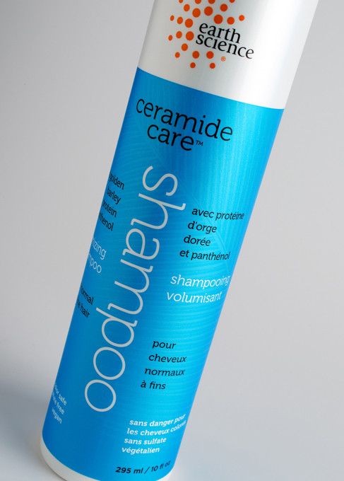
MOI_ESN_2

Millennials gravitate to authenticity and information. We did a deep dive into the product qualities and discovered what would become the graphics. The key attribute of these new products is their use of Ceramides. Simplifying the explanation of one approach used in its manufacture, the process of the synthesis of ceramide begins with the condensation of palmitate and serine. Palmitic acid mainly occurs as its ester in triglycerides, especially in palm oil. Serine is first obtained from silk protein.

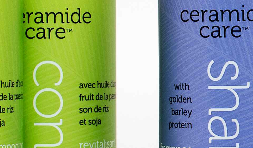
MOI_ESN_3

We used “palm” and “silk” as inspiration for the graphics and reproduction techniques applied to the containers. “Palm” was shown by using “ghosted” palm leaf images. “Silk” was made by using metallic inks printed on pearlescent film which created a shimmering look and a soft touch. Vertical type was used to clearly differentiate the word “shampoo” from the word “conditioner.” This is important when consumers are in a shower and cannot see clearly. And this design device allowed us to cleverly divide the French from the English copy.

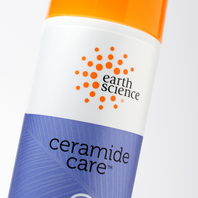
MOI_ESN_4

After the project was completed, Dion Label Printing spotlighted the Earth Science package as an example of packaging excellence and to show their ability to recreate high end packaging art.

“Ceramide Care,” trademark, and packaging ©2016 Earth Science Naturals.