Tag Archives: design

Tarazi Falafel Mix: Making something old new again.

Tarazai is found in specialty and ethnic food stores nationwide. For the past 40 years, consumers have used the traditional middle eastern mix of ground chickpeas and fava beans to recreate the familiar dishes they grew up with or left behind in their native countries.

But not long ago a funny thing happened. Falafel began showing up in restaurants and food trucks in places like New York City. A generation of new users is emerging eager to consume at home the foods they’ve grown to enjoy when eating out, or during travels abroad.

The management at Tarazi noticed the increase in interest in Falafel and asked MOI to help them expand the brand appeal to new markets. The challenge for the team at MOI was to refresh the brand to appeal to the new consumer while not alienating the old one.

An additional challenge the team discovered was the need to separate the product from “protein substitute” products. Research showed that traditional consumers and younger ones alike were attracted to the product because of its great taste and traditional nature, not because it made a good veggie burger or meat substitute.

Falafel and vegetables tumbling into the open pita signify the fresh taste experience consumers expect while portraying the well-known use of Falafel. Reference to meat substitutes was dropped, and copy was added on the benefits of the product.

The trademark was redrawn with proper letterforms, but retained the feel of the old logo for past consumers. The crisp and clean presentation sets the product apart from others in the ethnic foods section.

As agency CEO Mark Oliver noted, “this refreshing design creates the impact and interest to pull a consumer to a great old product, now new again.”

Timeless packaging design for today’s consumer

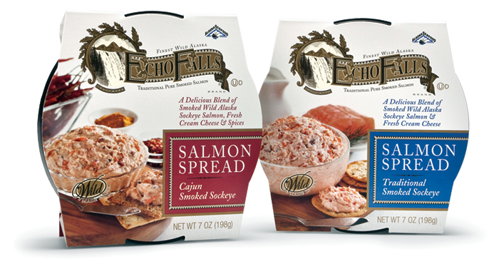
Research has shown that an emerging trend in CPG is the consumer’s desire to purchase products that offer comfort and convenience, along with healthy ingredients. Comfort translates into design and images that evoke authenticity, trust, and even nostalgia.The challenge of convenience is to convey that a product is easy to use. Healthy ingredients translates into products that are fresh and natural.

The country’s leading producer of smoked seafood and long-time MOI client Ocean Beauty Seafood approached the creative team with the challenge to create new packaging for a line of fresh-made salmon spreads to be sold in delicatessen departments in supermarkets.

Using the research as a starting point, the team crafted a branded appearance that invoked the nostalgia for the authenticity of an earlier period, in this case the Victorian-era, using a “heritage” look. The packaging incorporates copy and visual cues throughout to convey the ready-to-use aspect of the product. A big marketing plus is the product’s use of wild caught sockeye salmon, which is a sustainable fish, a fact which was included in many places on the package. Additionally, for shelf display, the innovative sleeve has the ability to stand up on its edge.

Agency principal Mark Oliver noted that the key considerations “were to assure the buyer that the products had the authentic taste and quality of an old-world smoked salmon product while at the same time providing all the values and conveniences that modern consumers look for. We think the packaging delivers on all counts.”

Carhartt Vineyards, blowin’ in the wind

Established in the early years of last century, Rancho Los Olivos is a Santa Ynez Valley landmark spread among the old Valley oaks. The 3rd generation owners felt the time had come to step up from the old label which marked their premium wines. The industry is full of idiosyncratic labels, very few of which address the challenges of standing out from a wall of wine in a retail environment. The team at Mark Oliver, Inc. considered telling the story of the Rancho because it was distinctive. But where were the visual story-telling elements that would allow us to brand the wines individually and as group and appeal to consumers?

We found the answer on a blustery day by looking up. We heard noises coming from the rooftops of various barns and outbuildings. And there was the answer: a vast array of shapes and sizes of distinctive animal weathervanes turning to face the wind. The rest was a breeze.

new labels

old label
Old Carhartt Wine Label