Tag Archives: packaging

Where does your food come from? Bar codes reveal all.

Do you know where the food you are buying comes from?

Does the country of origin make a difference in what you purchase?

Many products no longer show where they are made, only the location of the distributor. With the globalization of food sourcing, what you are buying can come from anywhere.

If you’re concerned about the origin of the item you are purchasing, there is a simple key to being informed.

It’s the bar code. By simply knowing how to read the numbers, you can be a more informed consumer. Keep in mind that while it is true many products of foreign origin use the U.S. or Canadian bar code, others do not.

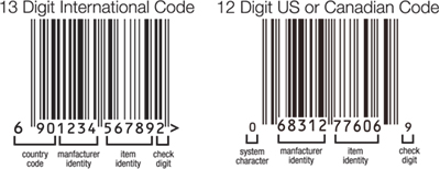
Here are some basic tips. U.S. and Canadian bar codes have a 12 digit number and all other international codes have 13. The first three digits of the 13 digit international bar code show the country of origin.

Below is the key to de-coding the code.

Some of the more dominant international codes are:
France 300-379
Germany 400-440
Japan 45-49
Taiwan 471
Philippines 480
Hong Kong 489
Poland 590
China 690-695
Mexico 750
Chile 780
Brazil 789-790
South Korea 880
Thailand 885
India 890
Vietnam 893
Indonesia 899

As an aware consumer, expand your purchasing decision beyond price and ingredients. Know where your product comes from and purchase with assurance.

For more country code information:
www.makebarcode.com/specs/ean_cc.html

Timeless packaging design for today’s consumer

Research has shown that an emerging trend in CPG is the consumer’s desire to purchase products that offer comfort and convenience, along with healthy ingredients. Comfort translates into design and images that evoke authenticity, trust, and even nostalgia.The challenge of convenience is to convey that a product is easy to use. Healthy ingredients translates into products that are fresh and natural.

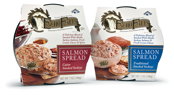
The country’s leading producer of smoked seafood and long-time MOI client Ocean Beauty Seafood approached the creative team with the challenge to create new packaging for a line of fresh-made salmon spreads to be sold in delicatessen departments in supermarkets.

Using the research as a starting point, the team crafted a branded appearance that invoked the nostalgia for the authenticity of an earlier period, in this case the Victorian-era, using a “heritage” look. The packaging incorporates copy and visual cues throughout to convey the ready-to-use aspect of the product. A big marketing plus is the product’s use of wild caught sockeye salmon, which is a sustainable fish, a fact which was included in many places on the package. Additionally, for shelf display, the innovative sleeve has the ability to stand up on its edge.

Agency principal Mark Oliver noted that the key considerations “were to assure the buyer that the products had the authentic taste and quality of an old-world smoked salmon product while at the same time providing all the values and conveniences that modern consumers look for. We think the packaging delivers on all counts.”

Carhartt Vineyards, blowin’ in the wind

Established in the early years of last century, Rancho Los Olivos is a Santa Ynez Valley landmark spread among the old Valley oaks. The 3rd generation owners felt the time had come to step up from the old label which marked their premium wines. The industry is full of idiosyncratic labels, very few of which address the challenges of standing out from a wall of wine in a retail environment. The team at Mark Oliver, Inc. considered telling the story of the Rancho because it was distinctive. But where were the visual story-telling elements that would allow us to brand the wines individually and as group and appeal to consumers?

We found the answer on a blustery day by looking up. We heard noises coming from the rooftops of various barns and outbuildings. And there was the answer: a vast array of shapes and sizes of distinctive animal weathervanes turning to face the wind. The rest was a breeze.

new labels

old label
Old Carhartt Wine Label