Bubbies Hawaii got its start over 30 years ago making slow-churned premium ice cream in the Hawaiian Islands. After becoming one of the most popular regional ice creams, it introduced mochi ice cream: a partially flattened sweet rice dough ball wrapped around an ice cream core. Sales took off. To expand their nationwide sales, Bubbies needed to re-design their branding and packaging.
The team at MOI (Mark Oliver, Inc.) found that no brand was doing a decent job of presenting mochi ice cream to the buying public and that a good opportunity existed to stand apart from the crowd. For example, photos or illustrations failed to give the product of any manufacturer appetite appeal. And none showed product or explained what they were in such a way that to a consumer unfamiliar with mochi ice cream would want to try them—unless they were already buying them. That approach does not grow sales.
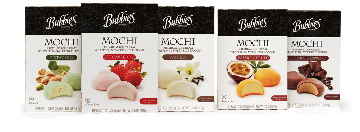
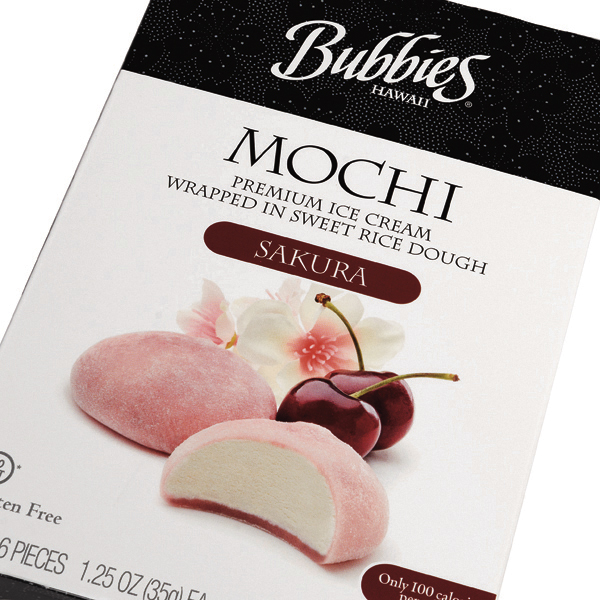
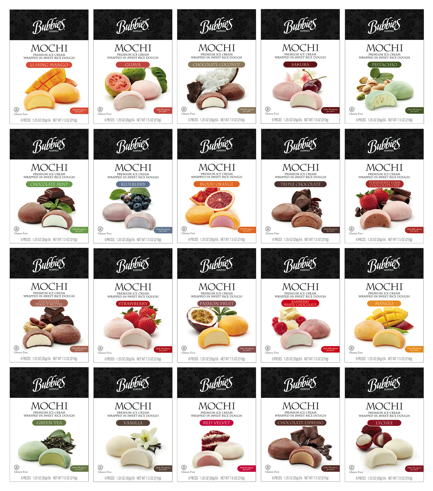
MOI focused on creating appealing visual images of the 20+ SKUs: various exotic fruits and ingredients made enticing flavor cues. We made a new wordmark that was easily read yet referenced the old. The team used classic type faces, an easy-to-understand explanation of what a mochi was, and added plenty of white space to focus attention on the hero shot, completing the identity lockup for Bubbies. The new design re-positioned Bubbies mochi ice cream as visually appealing and a decidedly upscale dessert and treat.
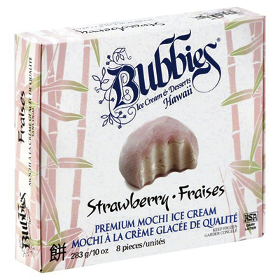
Old packaging


