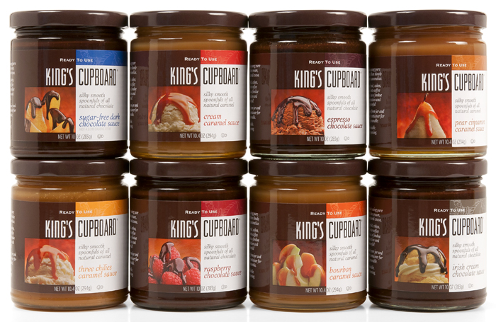
King’s Cupboard had an unusual problem. Their chocolate and caramel sauce packaging was too pretty. Designed mainly for high-end food boutiques and gourmet shops, the client felt it lacked the necessary impact to attract the consumer in regular grocery aisles, either natural or conventional. As the fastest growing arena of sales for the successful Montana-based business, the advantages to be gained by making changes to the packaging were compelling.
The firm asked the branding team at MOI (Mark Oliver, Inc.) to come up with a solution that would punch up the product’s presence on the store shelf. We told them that consumers spend less than 2.5 seconds considering a product, that what works visually has to work immediately, that there are no second chances — and that differentiation is key.
Our segment review showed that 90% of the competitive set did not include a photo of the product in use; however the best-selling brands did. Another find was that consumers guiltily admitted eating the product by the spoonful straight from the jar. The wonderfully natural human behavior trait became part of our copy and broadened the appeal of the product.

The design solution for the primary display panel was a visual narrative showing photos of the product in use, the “spoonful” copy, modified visual cues that would maintain some the old brand equities, and product color coding. A warm, appealing story completed the backside narrative. The brand redesign covered all the products and corporate identity materials.
