Windrun Wines
Services: Branding, Packaging Design, Production Supervision
Windrun Wines is a boutique Santa Barbara County-based négociant solely focused on producing select Pinot Noir and Chardonnay wines sourced from the finest vineyards in California. Their mission is to provide high-quality wines at everyday prices. Possessing a clear understanding of who they were as a company, Windrun requested a brand relaunch that would fuel the wine’s recognition on a store shelf.
What wine should one buy? How does a consumer make that decision? Do they buy by the label appearance, by price, by recommendation, or by knowledge? What grabs attention in a confusing and over-saturated wine aisle? Understanding how this process works and then creating a brand that stands out is what MOI did for Windrun.
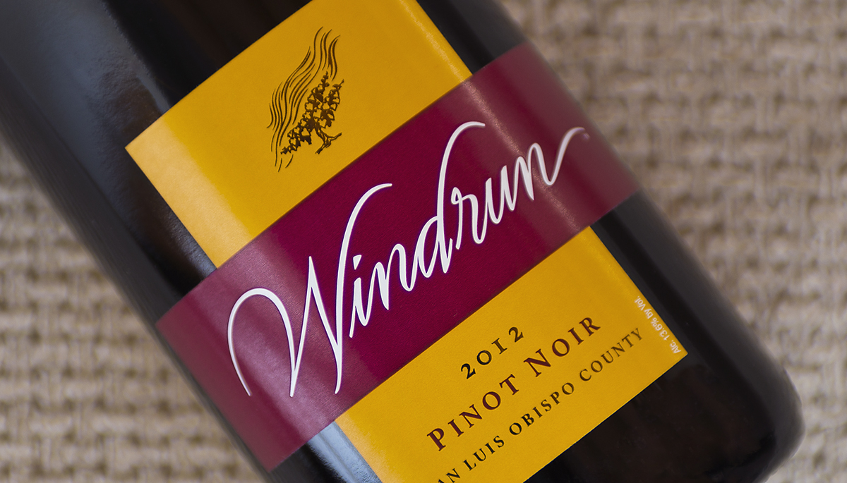
The creative process began after researching and assessing the competition, analyzing consumer and industry studies, and surveying key distributors and brokers. Visual cues were explored and developed that positioned Windrun as a friendly, easy-to-approach purchase and a high-value premium wine. Divergence from the competition and overall simplicity were the keys to the design. The type selected was elegant while a friendly color palette set the contrast to competing brands. Extraneous elements were not included, and an austere, super-premium look was strictly avoided. The label was printed with flexography which provided superior reproduction at an affordable price.
The distinctive label has been well-received and had the desired effect of bringing greater notice to the wines. Nothing makes a wine shopper happier than discovering a great bottle of wine for a good price. But first they have to see it.
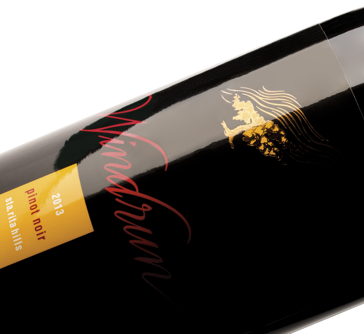
Windrun produced a limited production of 2013 SRH Pinot Noir to burnish the winery’s already good reputation with wine writers and knowledgeable consumers. They asked the group at MOI to come up with a label as classic as the wine itself.
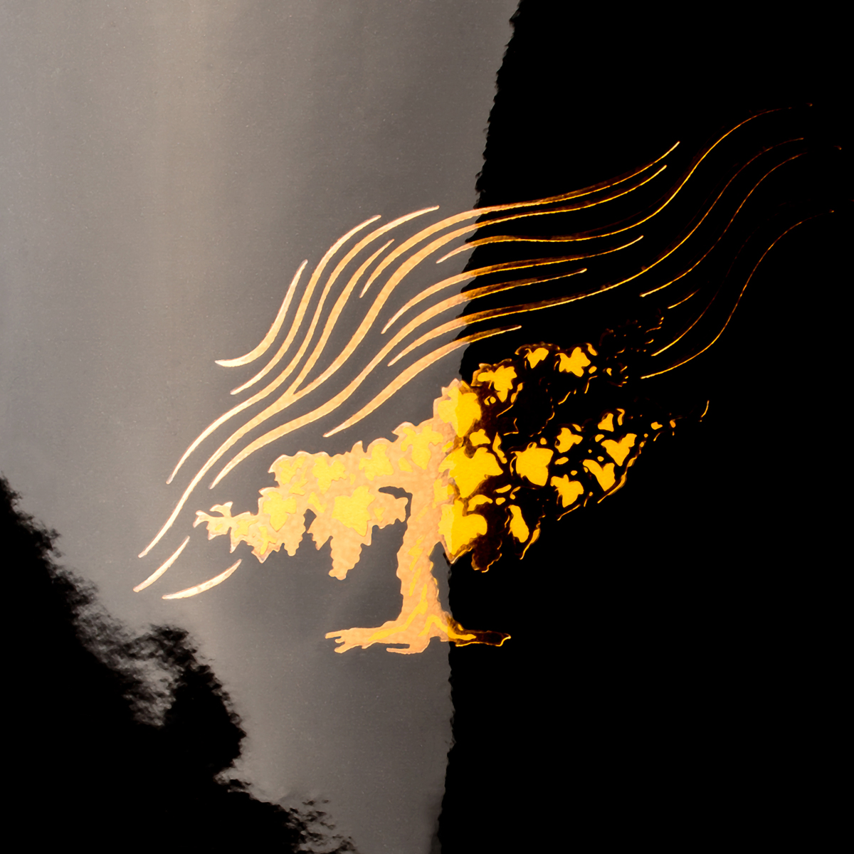
It is rare to see a wine label that is nearly all black. Using beautifully fluid letterforms, a vine drawn by renowned illustrator Tom Hennessey, and simple typography and color, we created a label of simple bespoke elegance. The most recent label printing technologies produced a mirror-like finish. Gold foil stamping, and rich, warm, colors help to give the label a stunning presence.


