Stahmann’s Pecans
Services: Branding, Packaging Design, Production Supervision

The road from New Mexico family ranch to Nieman Marcus is not an easy one to walk. No matter how rich the tradition, or how sweet the pecan brittle, no company moves their product into select stores without the look, so when Stahmann’s set their sights on upscale, they asked the designers at Mark Oliver, Inc. to pave the way.
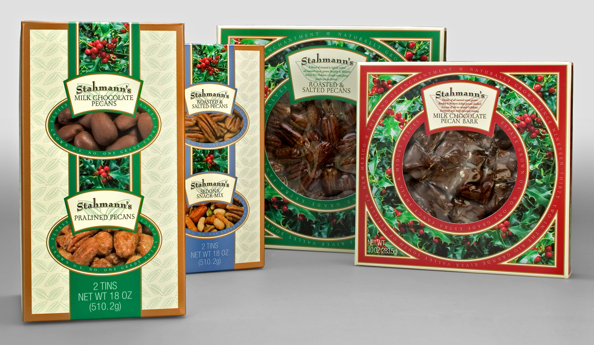
Started on the banks of the Rio Grande river in 1932, Stahmann’s (the largest privately-owned pecan producer in the world) had established a successful catalog business and country store, but wanted to expand into the world of fashionable gourmet retailers nationwide. The problem, however, was stale packaging that failed to reflect the quality of the product. Awash with muted beiges and featuring Texas-style western fonts, the look was pioneer – but decidedly not gourmet.
To reposition and brand the product line, the client had two thoughts in mind: heritage, and appealing to a high-end customer base. Incorporating the two was the challenge.
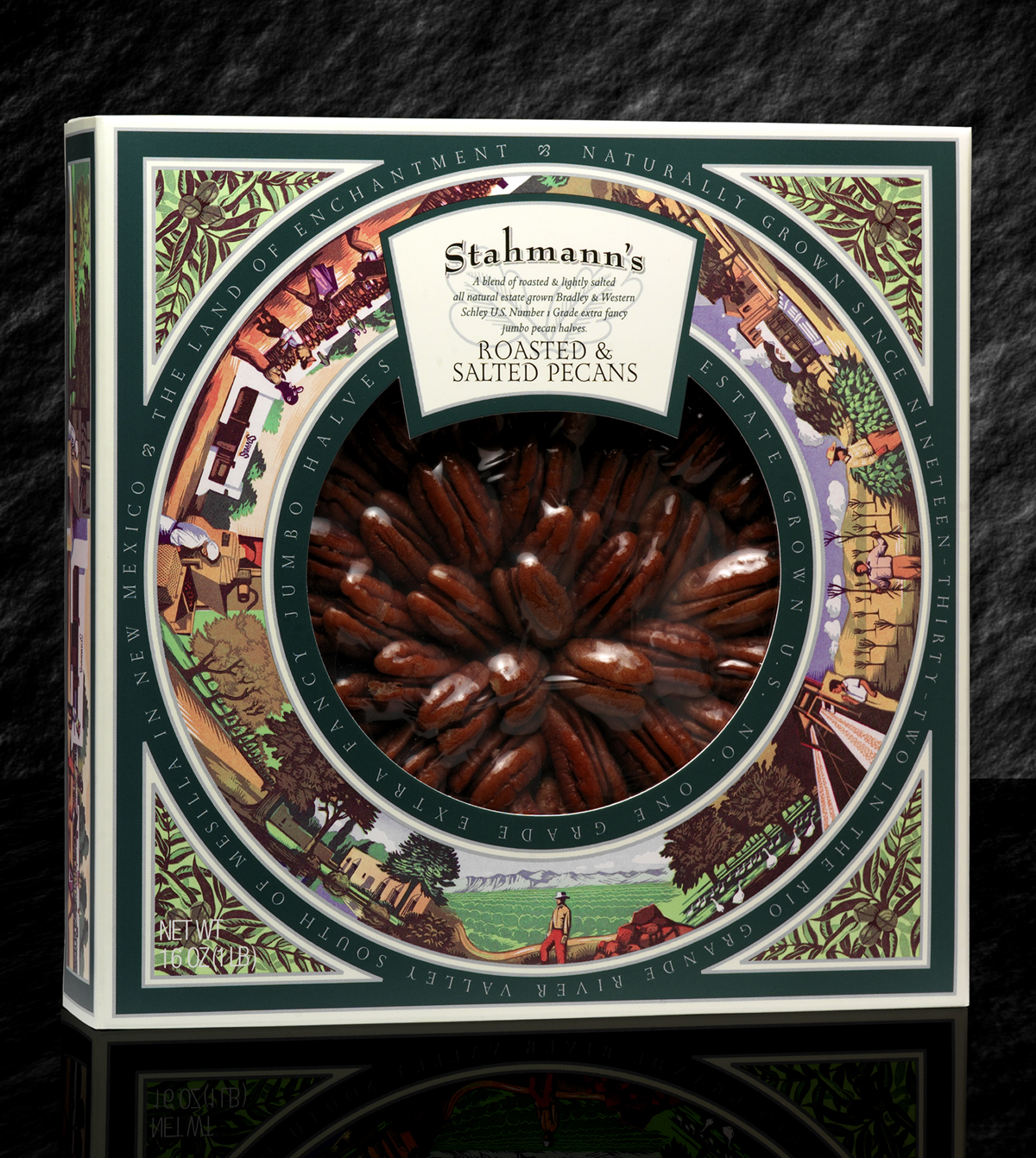
To better appreciate the Stahmann heritage, staff members traveled to New Mexico gaining access to the family, ranch, employees, and to the rich New Mexico landscape. Privy to family stories covering seven decades and to photographs of such annual ranch events as a mock bullfight, they cultivated a visual story and timeline they knew could beautifully illustrate the heritage of the ranch. The strategy for introducing the company into the homes of high-end consumers became clear: make the legend a picture – make the picture a package.

They say a picture is worth a thousand words, and nothing could be more true in the Stahmann’s case. Rich with the company’s old west lore, the design team created an illustrated narrative of significant events complemented by an elegant, classic treatment of type and color, and captured the essence of old New Mexico. Illustrator Jeremy Sancha was tasked with recreating the family history in his linocut style, and we ended up with eleven scenes capturing the ranch both as it was, and as it is today. Each handsomely illustrates the way of life on the ranch and brings a sense of connection between the target audience and the product’s origins.
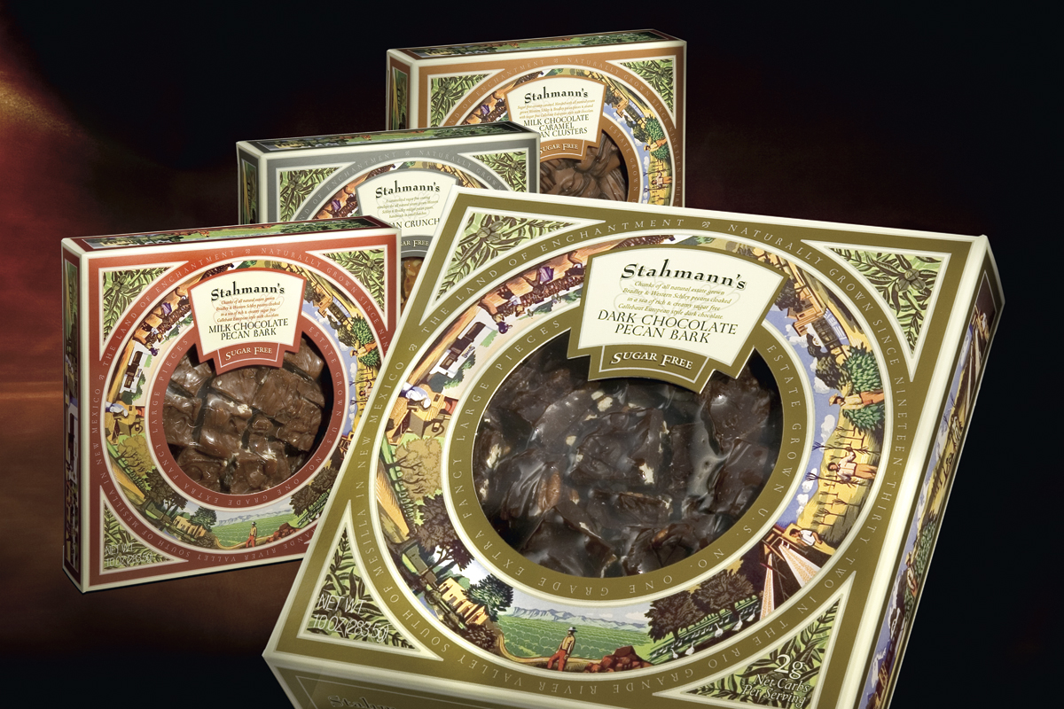
To complete the updated look, the Stahmann’s brand was redesigned to a classic logotype with modern appeal, and a brief narration of the company’s roots was added to the back of the package tying to the pictures arranged around the product window on the front. Final details included choice wording within the borders of the package’s illustrations verifying both quality of product as well as positioning its origins in the “Land of Enchantment”.
The value-added packaging has evolved to include some 50 SKUs.