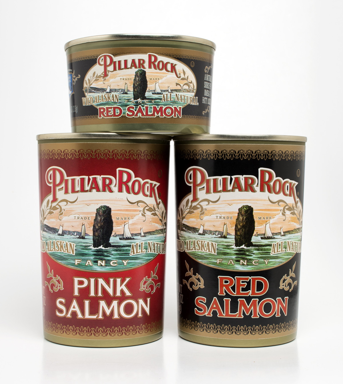
Pillar Rock Salmon
Services: Branding, Packaging Design, Production Supervision
Occasionally a challenge comes along that is unlike others. Ours was to refresh a 125 year old brand from Oregon. Because of a long-established consumer base, great pains were taken to make the new bringing and packaging “feel” like the old one, while changing virtually every element and updating the old logotype. But attracting new consumers was also a priority.
A customer favorite for nearly a century, the branding and packaging of the Pillar Rock line of salmon products was in dire need of refreshing. The treatments of the 60s and 70s had not been kind to the brand.
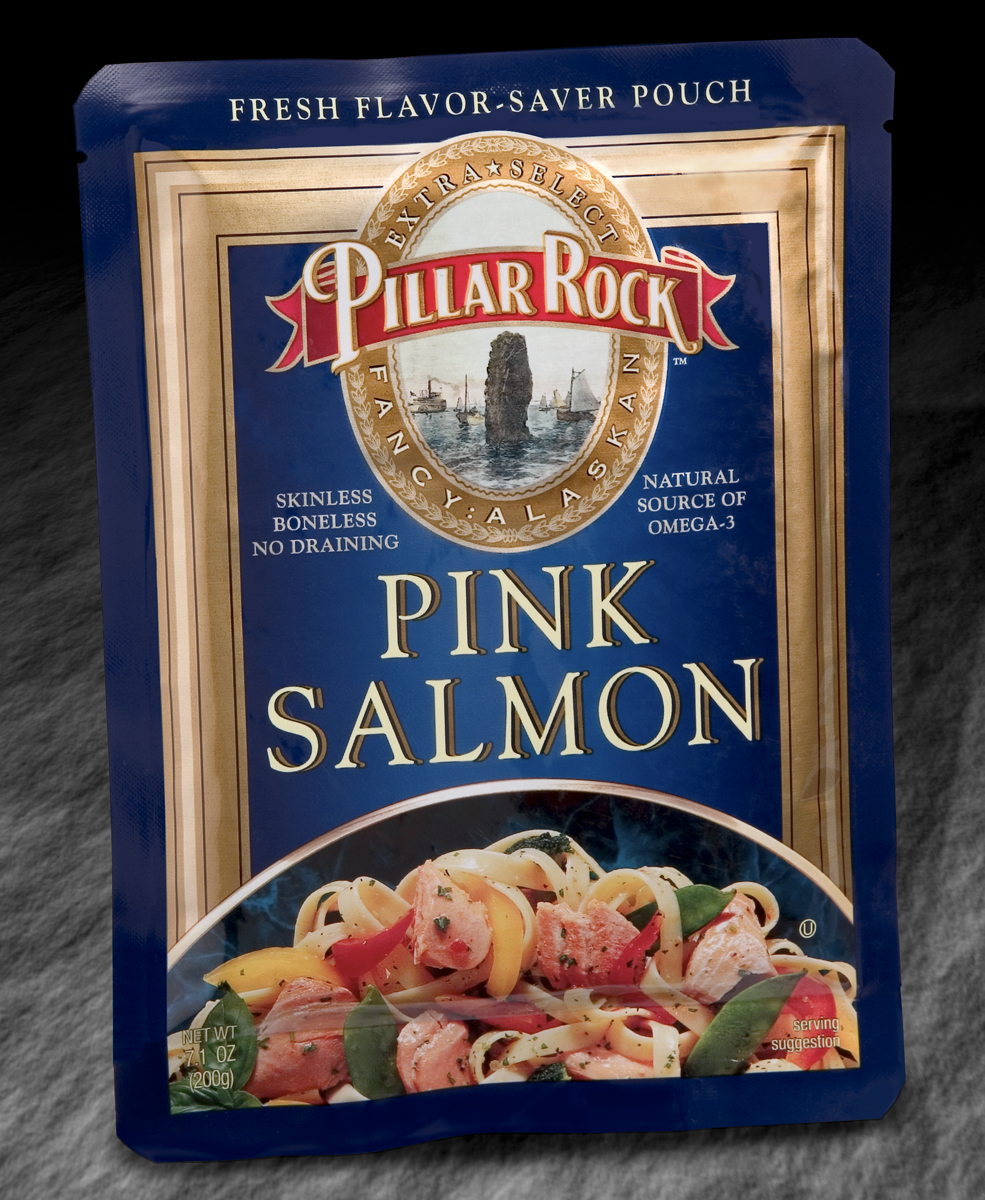
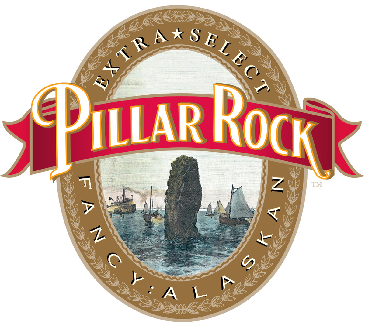
We re-positioned it as a product of an 1880’s traditional fishery. We married an authentic old illustration illustrating the real Pillar Rock at the mouth of the Columbia River. We then surrounded the image with traditional fonts and decorations that would evoke the period to create a look of heritage. We projected an image of high-quality appropriate to the product’s price point. The salmon is packaged in cans and pouches.