Echo Falls
Services: Strategy, Branding, Packaging Design, Production Supervision (PDF Case Study)
Tying a product to a tradition can be a powerful tool in marketing, even in this day of smart phones and iGen shoppers. According to a recent specialty food industry survey, 79% of iGen consumers and 67% of millennials purchase specialty foods. That makes brands like Echo Falls smoked salmon a likely target of their interest. But how to capture their attention?
Some of the benchmarks of today’s consumers interests, especially younger consumers, is the importance of tradition and authenticity to them. Long a manufacturer of quality smoked salmon products under various brand names, the client wanted to create a brand with the superior qualities lacking in their other product lines that would appeal to these consumers.
It is difficult launching a new product straight to the top tier of a category when it has no background or history. MOI discarded the concept of “new” during development, instead molding a timeless, authentic-looking, faux-heritage look that spans three centuries to sell the range of high quality smoked salmon products.
To establish the required sensory-driven experience for consumers that is pleasing to both the eye and the touch, MOI explored the visual vocabularies of bygone eras looking to provide the product line with a package design aligned with current tastes and shopping attitudes.
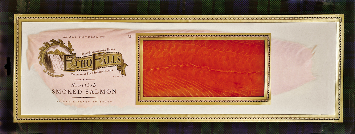
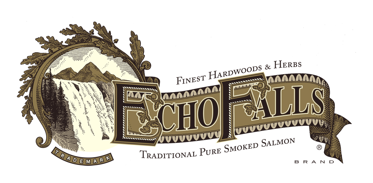
Research led to the review of packaging labels of the late Victorian period in England that often boasted steel plate engravings that exuded authenticity, elegance and tradition. To establish creditability with the consumer, the team at MOI (Mark Oliver, Inc.) aligned the product with the Scottish tradition of providing the world’s finest smoked salmon products. Pen and ink artist Harry Bates created the Echo Falls illustration, penning an antique emblem of the falls with a banner.
The design was further embellished with leaves above the emblem, an ornamental trim around the banner, and elaborate lettering of the “E” and “F” of Echo Falls.
Adding “Brand” and “Trademark” further tailored the image. The ornamental trim from the Echo Falls banner was incorporated into frames between the border colors and cream and the product window. Fine details included classic fonts with wood-cut accents, and a nineteenth century woodcut inlaid with a written “story” on the back of the package to link with the visual cues of the brand on the front.
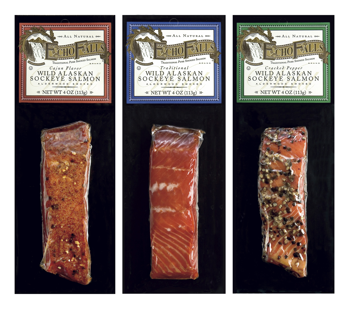
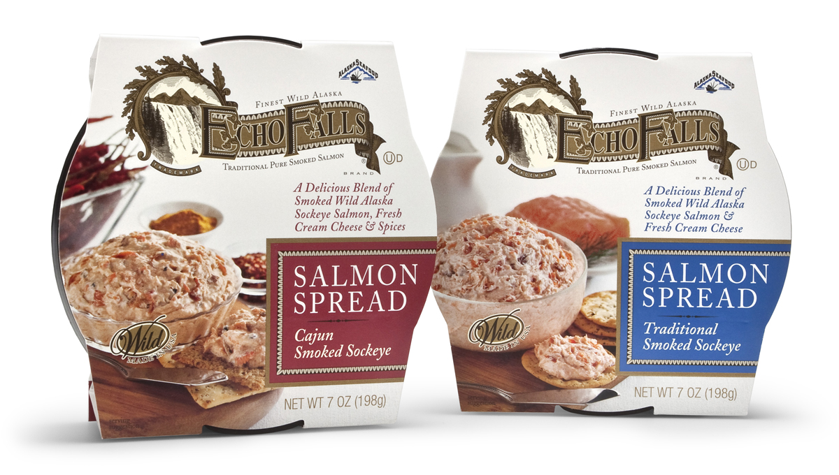
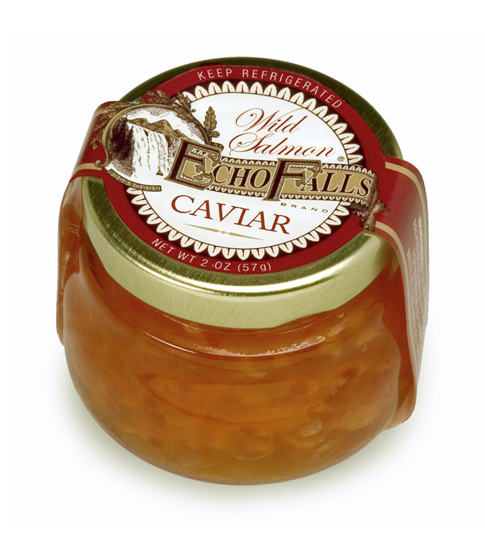
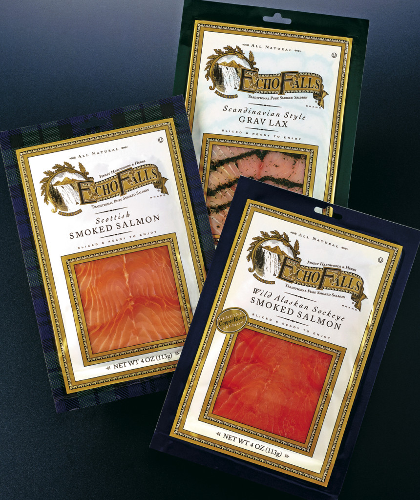
More than 70 SKUs have been created for Echo Falls, including packaging for caviar, hot smoke products, various salmon spreads, salmon candy and more, all of which have been well received in markets nationwide.
MOI created a classic twenty-first century brand inspired by the nineteenth. Consumers in the U.S. can’t seem to get enough.