Wine label design: Flying goats and floating bubbles.

Humor can be a great salesman (and the the packaging for the wine industry could certainly use some design levity).

Two pet pygmy goats, named Never and Epernay, loved to jump from heights. With their unrestrained spiral loops, flipper turns and straight-legged leaps they were a constant source of entertainment. When choosing a name for his new brand of Santa Barbara County wines, Norman Yost wanted to project fun, enjoyment, and happiness. Norm is a playful spirit so he opted to name it after his flying kids, Flying Goat Cellars.

When it came to his all natural sparkling wines, with a wry sense of humor Norm called them “Goat Bubbles.” He gave the packaging design and branding team at MOI (Mark Oliver, Inc.) poetic license to come up with innovative wine labels. With a name like that, the graphic design was pretty obvious. We put a goat illustration within its own bubble, each goat positioned a little differently in each bubble, all of them floating up from the bottom of their bottles. The creative result is playful and an unusual design solution as well.
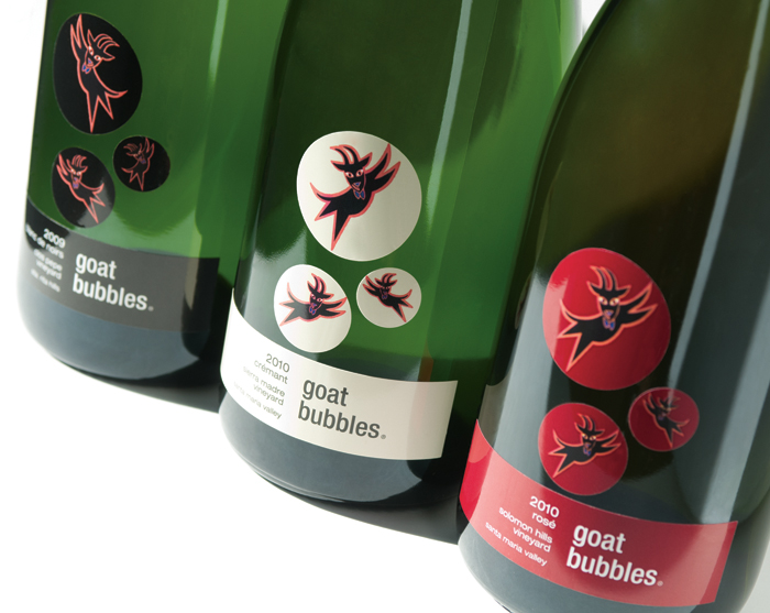
Goat Bubbles

The four-part label is unique from a wine label production standpoint, too. The printer had never created a multiple element label of this complexity and tests were conducted to assure the label film would adhere properly during production. Finally, each of the wines has a hand-dipped colored wax crown that matches the label color. The result? Adults love it. The kids, too.

Where does your food come from? Bar codes reveal all.

Do you know where the food you are buying comes from?

Does the country of origin make a difference in what you purchase?

Many products no longer show where they are made, only the location of the distributor. With the globalization of food sourcing, what you are buying can come from anywhere.

If you’re concerned about the origin of the item you are purchasing, there is a simple key to being informed.

It’s the bar code. By simply knowing how to read the numbers, you can be a more informed consumer. Keep in mind that while it is true many products of foreign origin use the U.S. or Canadian bar code, others do not.

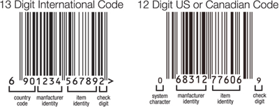
Here are some basic tips. U.S. and Canadian bar codes have a 12 digit number and all other international codes have 13. The first three digits of the 13 digit international bar code show the country of origin.

Below is the key to de-coding the code.

Some of the more dominant international codes are:
France 300-379
Germany 400-440
Japan 45-49
Taiwan 471
Philippines 480
Hong Kong 489
Poland 590
China 690-695
Mexico 750
Chile 780
Brazil 789-790
South Korea 880
Thailand 885
India 890
Vietnam 893
Indonesia 899

As an aware consumer, expand your purchasing decision beyond price and ingredients. Know where your product comes from and purchase with assurance.

For more country code information:
www.makebarcode.com/specs/ean_cc.html

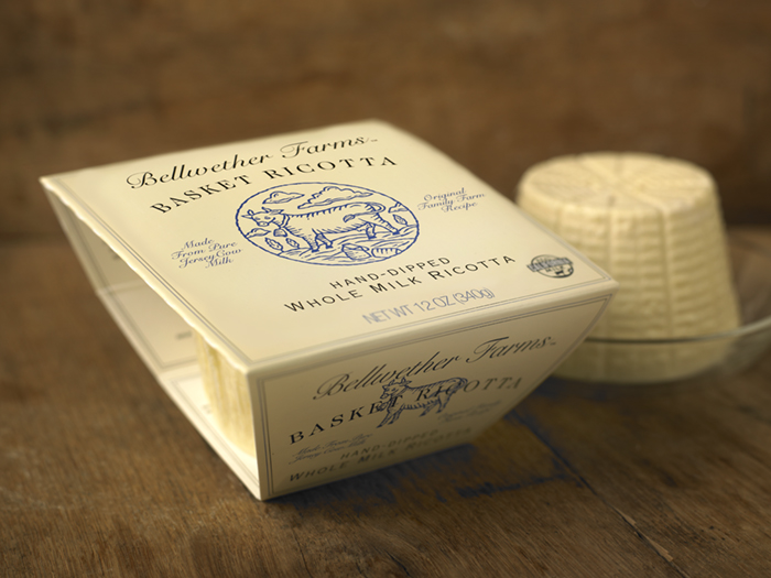
Bellwether Farms basket ricotta packaging

Bellwether Farms is an award-winning producer of farmstead cheeses and yogurts located in Sonoma County, California. A long-time client of our firm, they had invented a new way of crafting ricotta that brought to mind the exceptional qualities and flavors of the old-world ricottas of northern Italy.

A key component of capturing that quality was to use a special basket to allow the ricotta to drain and form properly. Removing the ricotta from the basket to package it would destroy the product’s unique qualities, so it was decided to keep the basket and vacuum form a plastic seal around it.

The large piece of stiff film necessary to form the basket’s lid presented unique challenges for packaging. The client and design team at MOI also saw an opportunity to use the basket to showcase the product. Keeping the sides open allowed the design team to create a flap that tucked in on either side, snapping into position and holding the basket firmly in place. The open sides doubled as a “window” displaying the product within the basket.

Mark Oliver, CEO of the branding firm, noted, “often the most work goes into creating simple looking yet complex structures. After a number of prototypes, this elegant solution met the criteria for showcasing the product and maintaining the long-established branding scheme, while using environmentally sensitive outer packaging materials and soy inks.”

Photo © 2011 Alan Campbell acpfoto.com